Summary
An often-heard theme in supply chain management (SCM) and COVID-19 is “data-driven” – being data-driven is the path to success. For COVID-19 “science-driven” is often said in the same sentence. For SCM demand or customer-driven replaces “science”. From experiences going back to the 1970s, to be successful the key is an operations management (OM) perspective or approach where data, science, demand, etc. are components to support OM. This blog will provide examples to demonstrate the importance of OM for opening and maintaining confidence in the government. Even a rudimentary application of OM would have limited the “Choir Ravage” in March 2020. This is a tragic example of the limits of data-driven (figures 1-3 in “Lessons for COVID-19 and Supply Chain Management Models”). This blog is part of Arkieva’s COVID-19 commitment.
Introduction
An often-heard theme in supply chain management (SCM) and COVID-19 is “data-driven” – being data-driven is the path to success. For COVID-19 “science-driven” is often said in the same sentence. For SCM demand or customer-driven replaces “science”. From experiences going back to the 1970s, to be successful the key is an operations management (OM) perspective or approach where data, science, demand, etc. are components to support OM. When I joined IBM in 1977 data analytics and interactive computing were commonplace. By 1981 full graphics and windowing were becoming regular occurrences with the release of Graphical Data Display Manager (GDDM) and tools such as GRAFSTAT. In 1979 a senior IBM manager, Joe Isole, pointed out only following the data trail was the road to disaster. Inevitably the data was incomplete and existed without a business (OM) perspective which is critical for organizational success. Forty-plus years later, the same is true for SCM and COVID-19. This blog will point out a few examples in the COVID-19 challenge demonstrating COVID-19 is an OM challenge.
Basics of the COVID-19 Apex Curve
The COVID-19 APEX Curve is familiar to most of us, often used and the subject of much discussion– it’s the number of new COVID-19 events per day, where events might be new COVID-19 positive, new hospital admits for COVID-19, ICU admits, deaths, etc. – in some cases, smoothing is applied to the daily events when the data is presented. In the best of circumstance the curve rises rapidly, flattens, and then descends as fast as it rose as mitigation is fully effective. Figure 1 has “standard hoped for shape”. This is also the shape of the classical analysis using differential equations.
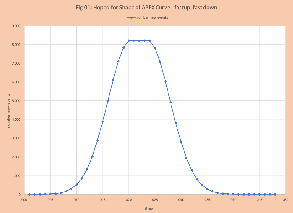
Figure 2 has the “APEX” curve for Delaware (as reported on their dashboard webpage) for new hospitalizations for the past 30 days. The shape is very different from Figure 1. This is an example of being data-driven, but not operations management (OM) driven. Without the influence of OM, the graph is nice, gives the appearance of providing information, but is in fact of little value in terms of actionable items. The trend line has no value and should not be posted. To start, its metric of goodness is terrible.
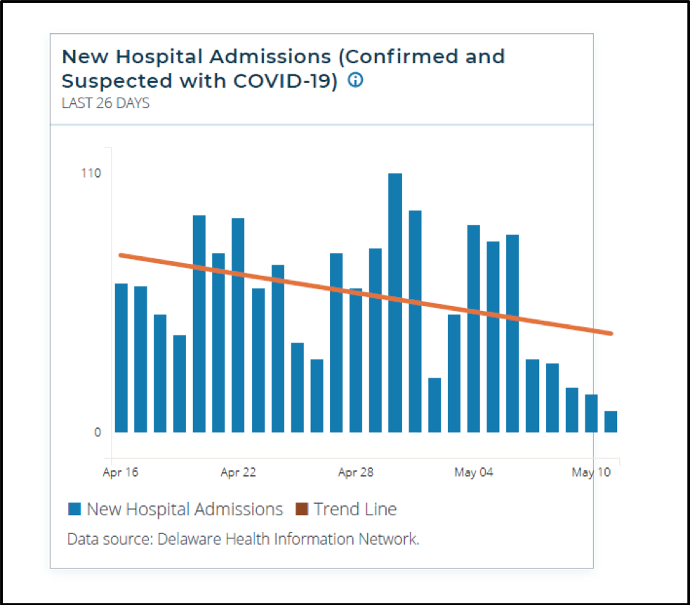
Figure 2: Apex Curve from Delaware Reporting Web Site on 05-12-20 30-day bar chart
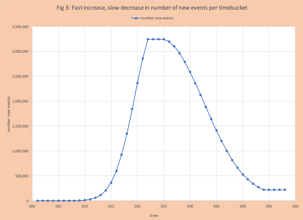
Figure 3 has an Apex curve like the one in New York with a fast increase and slowly decreases. NYS Gov. Cuomo often ponders – it would be great if the decrease was as fast as the increase. The more general question is what controls the shape of the curve? This answer and the general challenge of “reopening” is not fundamentally epidemiology or public health question, but how effective is your operations management (OM). Being data and science-driven without OM is a path to failure; a lesson successful factory and supply chain folks know quite well.
The purpose of the next section is to see the APEX shape from OM Eyes. Without an OM perspective to organize our thinking, then we trade thinking about an OM issue for blindly following data.
Understanding APEX Shape based on Energy and Low Hanging Fruit.
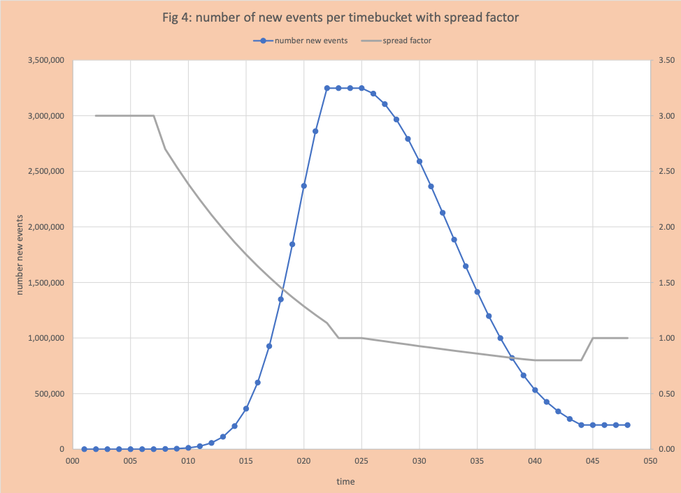
We will use Figure 3, which is like the shape of New York State Apex, as our example. Figure 4 is Figure 3 with the spread factor (SF, R0, or R-naught) plotted on the right-side vertical axis. The SF is the number of additional people infected per each new event. For example, on day 4 the number of new events is 9. SF is 3, the number of new events on day 5 is 27 (=3×9).
For additional information about Spread factor see:
- COVID-19 Taking the Mystery Out of the APEX Curve and Some Basics on Restoring “Normal”
- Complexity of the Basic Reproduction Number (R0)
Tables 1 and 2 have detailed data for this example.


Segmenting the data
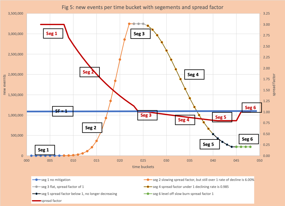
Our first step is to segment (well established as best practice for analyzing demand) the curve (figure 5) into the following groups.
Seg 1 (time buckets 1-7)
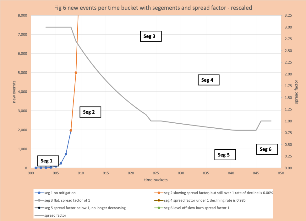
This has the highest spread factor (SF = 3) and there is no mitigation in place. Since it is early in the growth phase the absolute numbers are small compared to the maximum number of daily events later in the curve. However, it sets the base. Figure 5 is figure 4 rescaled to enable us to visualize the dramatic growth in the first 7 days.
Seg 2 (time buckets 8-22)
At this point the alarms have gone off and mitigation has begun. At this point mitigation is focused on limiting interactions and evolves piecemeal, where the “easy” is done first. For example, closing stores, taking down basketball rims, having people work from home, banning driving after 8pm, keep people from Pennsylvania from driving into Delaware except if they are working in the health care system. There was a different response by each state, even those with historically seamless borders. Pennsylvania closes liquor stores, Delaware does not. PA people drive 3 miles to DE liquor stores, but DE state police turn them away – even those that work in health care in DE. There is little OM thinking about what the impact of each action is on reducing the spread factor. Additionally, some people just stay home – a tactic that can work for a few weeks. That is the limitation of being just data-driven. For this example, we assume that mitigation will reduce the spread factor by 6% per day. For example, the spread factor on day 13 is 2.11 and on day 14 is 1.98. 1.98 = (1-6%) x 2.11 = 0.94 x 2.11. The harder stuff such as actually protecting seniors, face masks, shields at grocery stores, avoiding outbreaks at food processing facilities, comes later. By the end of segment 2 growth has peaked. Observe the spread factor is declining quickly during this segment, but its value remains greater than one, so the number of events continues to grow quickly. Absolute growth is a function of the spread factor and the number of new events that day.
Seg 3 (time buckets 23-25)
Is the level off segment. SF is 1 and the number of new events is constant.
Seg 4 (time buckets 26- 39)
Is the start of the decline. Observe SF is now under 1 and is declining at a much slower rate than in Seg 2. For this example, the rate of decline is 1.5%. Why is it slower? The easy stuff or low hanging fruit is gone, now the hard work begins. An example of low hanging fruit was folks just staying home. The “hard work” is even harder because there was no OM involved in Segment 2. For example, now masks are required if a person is in a store or enclosed space. In March, the government was telling folks masks were of no value. That is the trouble with just being data-driven in situations where data did not exist and not relying on OM. Since the primary pathway for the spread is respiration, the mask reduces the chances an individual’s COVID-19 respiration goes traveling (I can hear Joe Isole now saying “who needs data for something so obvious”). Other well-known examples are protecting seniors in elder care living and outbreaks in meat production.
- One-Third of All U.S. Coronavirus Deaths Are Nursing Home Residents or Workers
- The Whole Place Is Sick Now’: 74 Deaths at a Home for U.S. Veterans
- Families share stories of fear
- Pork Chops vs. People: Battling Coronavirus in an Iowa Meat Plant
- Not permitting seniors that are still COVID-19 positive to return to nursing homes and assisted living until they are COVID-19 negative (yes this really happened)
Resolving these situations requires real work and the work is made much larger by the failure of applying good OM skills to anticipate the obvious. In this example, for simplicity, I have lines that are smooth – no ups and downs. Outbreaks in hot spots drive short dramatic spikes COVID-19 Data Analysis Basics – Taking the Mystery Out of Smoothing Daily Counts.
Segment 5 (time buckets 40-44)
The number of events continues to decline, but the SF remains constant at 0.80). At this point we have run out of actions to take to drive SF down and poorly thought out activities reemerge that can drive up SF (especially when the government has lost confidence of its citizens by failing to apply OM to reopening). At this point the available actions to drive down SF the government finds it too expensive or politically impossible to take further action. For example:
- Conflicting policies on working in tight quarters.
- Place most meat processing in a few locations failing to diversify risk and provide the opportunity to close facilities on a rotating basis with impacting supply.
- Clustered living facilities that fail to provide space. This can range from college dorms to high-density housing in cities.
- Insufficient funding for eldercare facilities.
- Lack of testing.
- Adjustments in health care delivery that recognize everyone’s health is dependent on everyone else’s health.
All obvious with an OM perspective.
Segment 6 (time buckets 45-48)
SF returns to 1 and the number of new events is constant. What is referred to as the slow burn. As in Segment 5, additional work to reduce SF is either very hard or impossible or near term structurally or politically impossible.
The Next OM challenge – reopening activities
Determining what to reopen when and putting in place monitoring activities is the next dominant OM activity. Although most states, CDC, and the white house
https://www.whitehouse.gov/openingamerica/
https://governor.delaware.gov/delawares-recovery/
have established high-level metrics and guidelines before considering reopening, success depends on an OM perspective. Especially in the light of the complex political terrain.Some examples:
- In 3 Key States That Elected Trump, Bitter Divisions on Reopening
- Whitehouse Rejects CDC Recommendations
OM Challenge – high-level metrics
Various high-level metrics have been established to be met before reopening. Some pass the OM test. Examples:
- Enough hospital capacity to meet surge.
- Enough capacity to test and investigate hot spots the emerge.
- Ability to maintain limitations that must remain while others are eliminated.
Others do not. For example, requiring 14 consecutive days of decline. An OM perspective would immediately see:
- The issue is not successive decline, but an estimate that a surge isn’t just around the corner.
- What is special about 14 days (it turns out it comes from the incubation period, nothing to do with the assessing readiness).
- If the probability that the number of “events tomorrow” is lower than today is 99%, and assuming independent and identical distribution (IID), the probability of 14 successive down days is 87%. If the daily probability is 95%, the chance of 14 successive down days is under 50%
OM Challenge – Making Sense of data and correlations
Today’s technology makes it easy to collect data that might initially seem to be related to COVID-19. For example, capturing data on where people travel to and time at various locations. A recent report showed that overall folks were traveling more than in the early “shelter at home” period. The immediate headline implied more COVID-19 was around the corner. Perhaps! Certainly, if we put everyone into a bubble and fully isolate them for 30 days, COVID-19 numbers would drop. Using OM, one would see another option is after a month people are more comfortable about how to venture out safely to get takeout to support local restaurants. Delaware in fact promotes this with “take-out Tuesday”.
OM challenge – Opening Schools
Whether schools should open in the fall and under what conditions has become a very political discussion over the past 10 days.
Below are excerpts from reports in the NY Times
“I think we better be careful, if we are not cavalier, in thinking that children are completely immune to the deleterious effects,” Dr. Fauci said. “You’re right in the numbers that children, in general, do much, much better than adults and the elderly and particularly those with underlying conditions. But I am very careful, and hopefully humble in knowing that I don’t know everything about this disease. And that’s why I’m very reserved in making broad predictions.” Read More…
The president’s comments on Wednesday were an even more direct show of disapproval. “Now when you have an incident, one out of a million, one out of 500,000, will something happen? Perhaps,” Mr. Trump said, minimizing the risk to children of returning to school. “But you can be driving to school and some bad things can happen, too.” Read More…
Below is an OM interpretation:
Dr. Fauci’s observation – there is a non-zero chance that a COVID-19 positive child without symptoms, goes to school, and the virus will spread to one-half of the students in the school, some of which will get seriously ill, be hospitalized, and not be allowed, visitors. If, when reopening schools, we reopen other activities for children (gymnastics or children’s choir), that provides a path to other students and then into other schools. We know enough about COVID-19 to know it is clever in its prime objective – replicate itself using an unwilling host. If schools reopen, this outcome has non-zero a probability (even a low one), it is incumbent on government leaders to have a plan in place ahead of the potential fire, to nip it early. IT is certainly critical for children to get back to school, there are significant loss and damage from not being in school. The world’s most advanced and richest nation – able to take out a dangerous opponent with a missile – owes its most vulnerable to have a plan in place – just in case. We have already seen the devastation on the elderly for not having a plan in place. Front line doctors such as pulmonologists understand the trickiness of COVID-19 – the importance of community intelligence.
President Trump pointed there is risk in everything, you can be driving to school and bad things happen. This is true, but this argument has a subtle sleight of hand OM expertise would recognize as comparing apples to oranges. The assumption is made that both incidents are isolated. The occurrence of one does not trigger additional incidents and danger. If car incidents do cluster (for example passing stopped school buses), do we have a response? Yes. Law enforcement will swarm to shut down the spread. Law enforcement is powerless against a COVID-19 spread. It is simply sound OM tactics to have a response in place just in case.
Quality OM thinking would assess the downside risks of opening and not opening schools, estimate a probability distribution of risk and outcome, and decide on critical data that is needed. Then put in place a plan with contingencies based on previous experience.
Conclusion
Science, epidemiology, public health, data, and data analytics are important tools for success. I have personally experienced the challenge with “on a hunch start a bunch”. It is the OM perspective that is the key to success which incorporates community intelligence. Delaware is about to open beach towns and allow ice cream places to open. However, the rims on the two basketball hoops in Skyline middle school are still down. These were never a COVID-19 thread. This type of failure breeds a lack of confidence in government – applying OM can reduce this rift. Even a rudimentary application of OM would have limited the “Choir Ravage” in March 2020. This is a tragic example of the limits of data-driven – see figures 1-3 in “Lessons for COVID-19 and Supply Chain Management Models.”


