Introduction:
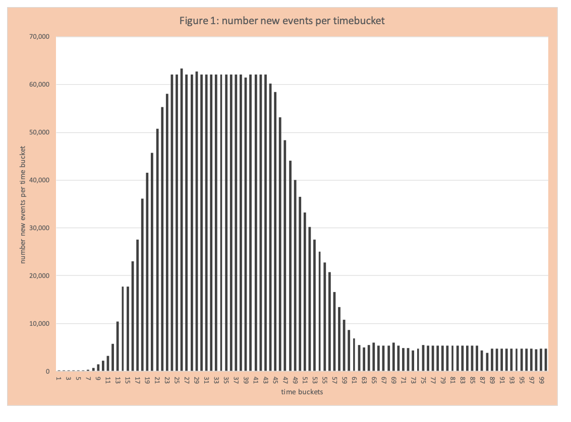
When one reads or listens to material about COVID-19, there are many graphs, data analytics and terms that are often not clear. The primary events tracked are COVID-19 positives, hospitalizations, ICU admits, and deaths typically presented as events per day or cumulative events across a set of days. In March 2020 the core concept discussed was rapid growth (exponential) and flattening the curve through social distancing (now called mitigation). Another critical aspect of the data analysis and the dominant topic for April is the “APEX” (figure 1). This blog will provide some basic information about the curve and statistical concepts (how the curve shape is controlled by the spread factor -called a parameter) and policy actions that drive the parameters.
Basics of APEX
The APEX curve is essentially the bar chart of events per day (time bucket) that includes actuals and projected (Figure 1). Typically, the shape has an uphill (rising number of new events per day), then a flattening (number of new events per day remains the same), then a downhill (number of new events per day declines), and then another leveling. The “typical” represents the goal of containing COVID-19. From a statistics perspective, the shape of the curve is controlled by the parameter called the spread factor, sometimes called R0. The parameter represents the impact of policy actions to contain COVID-19 (such as closing restaurants). We will illustrate these concepts (statistical and policy) using the following example.
Example
We will use the assumptions in an earlier blog on rapid growth.
The basic flow of infection and resolution
- A person who becomes COVID-19 positive on day (i) spreads the virus to others on day (i+1), by the end of day (i+1) we assume this person has been identified and is quarantined and no longer able to infect others. After some point in time they enter the flow and are now immune to COVID-19 and no longer able to spread the virus.
- The number of people who get COVID-19 on day (i) spread it to “spread factor” number of people on day (i+1). For example, on day 5 if the spread factor is 3 and there are 5 new COVID-19 people infected on this day, then on day (6) there are 15 (=3×5) who will be positive on day 6.
- It is the spread factor that controls the shape of the curve:
- Spread Factor >1, curve is going up
- Spread Factor = 1, curve is flat
- Spread Factor <1, curve is going down
Although the actual spread and resolution are more complicated than the one outlined above, this one is easy to follow and illustrates core concepts. Examples of other complexities are:
- An infected person can infect others for more than one day, the number of days vary, and the infection strength per day can vary.
- The people who can be infected (susceptible) have different probabilities of being infected based on the amount and intensity of interaction. For example, riding a crowded train for an hour increases your chance of being infected compared to driving by yourself to work in 15 minutes.
- The infection process is continuous, not in daily buckets.
Other important data to calculate per time bucket include:
- Number in a population who have never had COVID-19 -called susceptible
- Number in a population with active COVID-19 and able to infect others
- Number of people who have recovered from COVID-19 (can no longer spread the virus)
Details of the Example
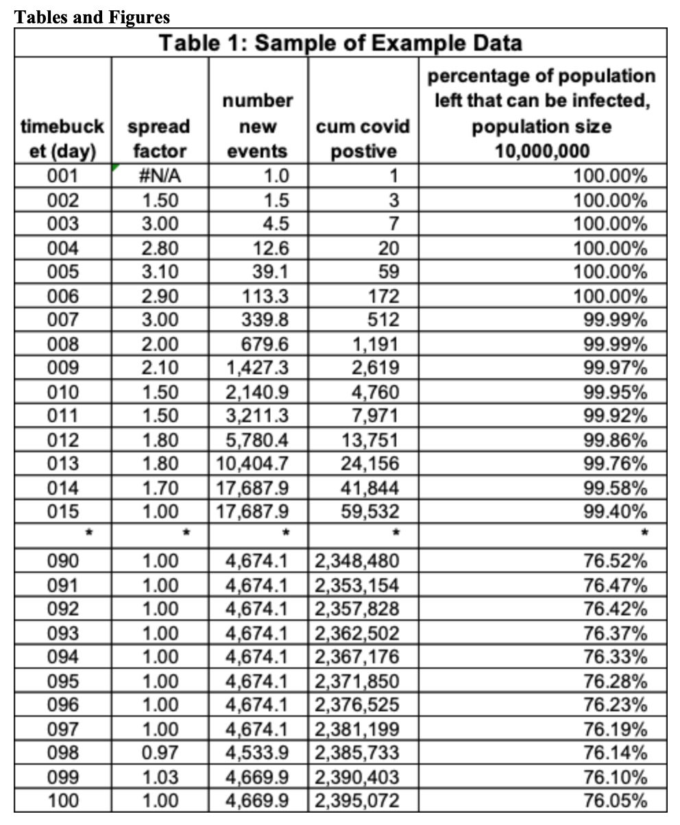
Table 1 has a subset of the “example data”. There is a total of 100-time buckets. The column is the spread factor. This is the average number of people someone newly infected the day before infects today. On day 2 the spread factor is 1.5, the number of newly infected people on the prior day (day 1) is 1, so the number of newly infected on day 2 is 1.5 (=1 x 1.5). Observe when the spread factor is greater than one, the number of newly infected exceeds the day before, when it is 1 the number is the same, and when it is less than 1 the number goes down. The last two columns calculate some critical values for analysis. Cumulative COVID-19 positives to date (decimal is not shown) and the fraction of the population that could be infected on that day. The population size in this table is 10,000,000. This value is (10,000,000 – cumcovid)/10,000,000. On day 11 this value is 99.92 = (10,000,000 – 7,971)/10,000,000.
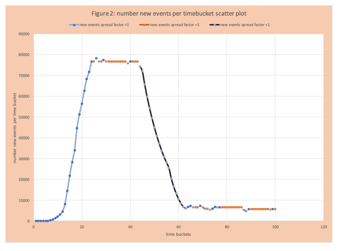
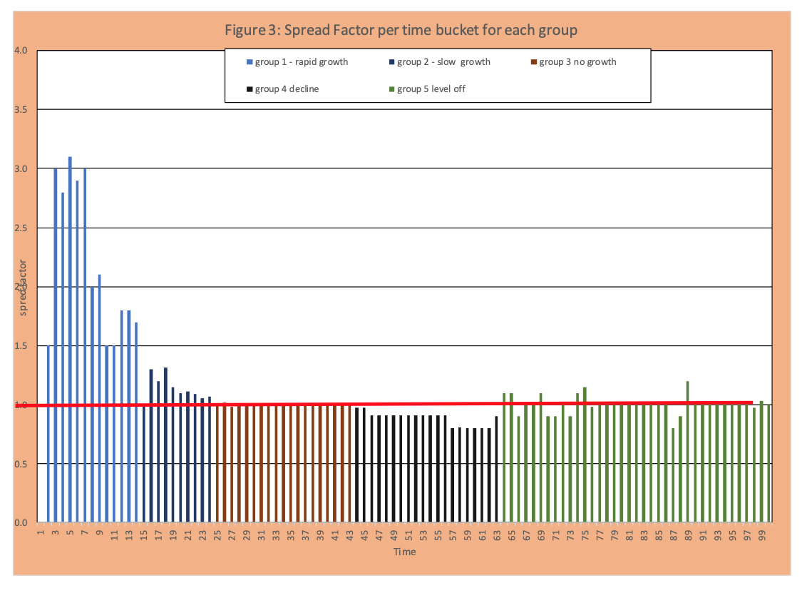
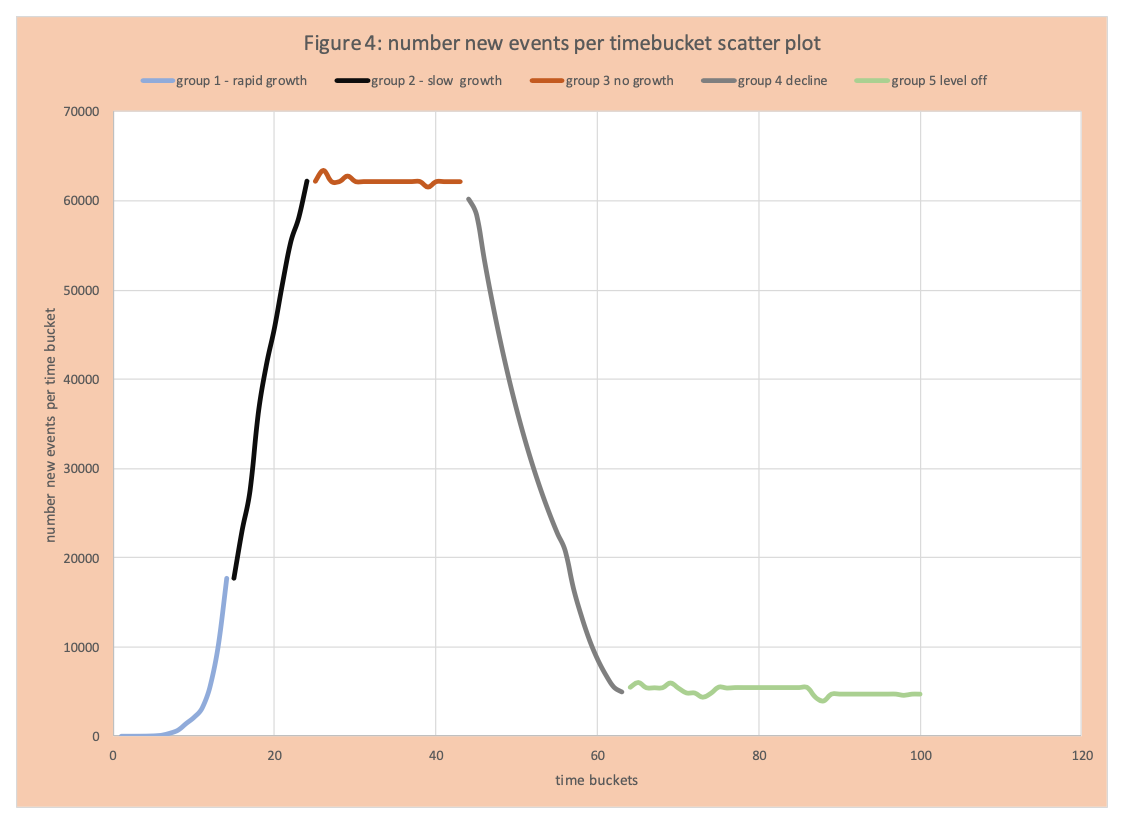
Visually this information is captured in figures 2 and 3. Figure 2 displays the number of new events per time bucket as in Figure 1, but segmented as follows: blue increase, orange flat, black decrease. We see an increase or growth of events per time bucket from day 1 to 24, then the flattening (same number of new events per day) from 25 to 45, then a decrease from 46 to 72, then another flattening (with day to day variation). Figure 3 has the spread factor by day. We see some very high values greater than 1 (group 1), then lower values still greater than 1 (group 2 slowing of the rate of increase), then values around 1 (group 3), values less than 1 (group 4 drop in new events per day), then values around 1 again (group 5). Figure 4 applies this same grouping to the number of new events per day (Figures 1 and 2) with the 5 segments or groups just defined.
Read More: Some COVID-19 Data Analysis Basics Part1 – New Events, Cum Events, and Logarithms
Outcomes and Policy
As mentioned before, the spread is just a mathematical construct to capture the impact actions taken and the inherent nature of the virus. The following links policies and virus nature to each group.
Group 1- captures the growth events when no mitigation actions are taken. Observe early the number of events seems to have hardly grown. This is the nature of exponential growth and seeing it requires experience and specialized skill – typical instincts fail here.
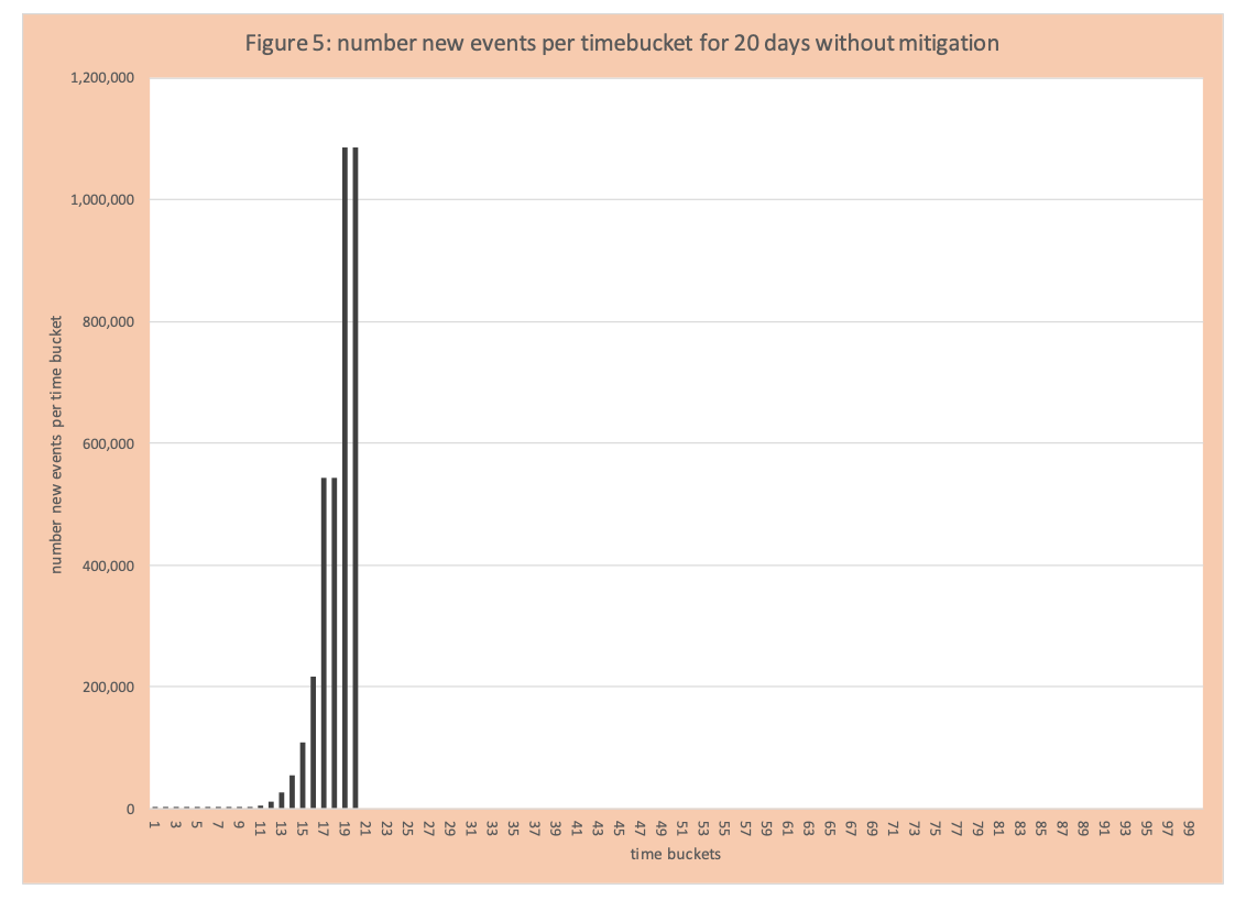
Group 2- the spread of the virus is on the rampage and now clearly noticeable. With either a method to treat or do full testing quickly (which did not exist) the spread factor would remain the same or increase without mitigation. Figure 5 has the number of events per day for 20 days without mitigation.
Group 3: The number of new events per time bucket levels off – that is these same number events (approximately) each day.
Group 4: Mitigation and other actions get smarter and the number of new events per time bucket declines. Some other factors (difficult to measure) are easily infected have been infected, those that left are harder to infect (based on their daily patterns and immune system and natural spacing – they don’t live in crowded spaces).
Group 5: A new steady state of events per day has arrived given all the mitigation actions in place and any “natural events”. Observe COVID-19 positives are not eliminated but are much lower and remain constant.
Mitigation
What is mitigation (social distancing)? It is a set of blunt actions to reduce the number of inadvertent interactions, therefore, reducing the spread factor. Tactics applied include:
- Businesses and organizations that can, must follow work from home guidelines – for example state offices, law firms, IT groups, etc.
- Only necessary businesses and organizations that cannot have work from home can stay open: grocery stores, pharmacies, takeout food, construction, delivery of packages (which includes all aspects of packaging and shipping, not just delivery), first responders, and medical facilities including care for the elderly.
- Other businesses must close – shopping centers, gyms, restaurants.
- Typically, within states the number of closures increased over time – for example initially, salons could stay open, then they closed. Dentists were open, then just emergency activities. In some states liquor stores could stay open, but in some states later closed.
- Wash hands regularly and avoid touching your face.
- Schools closed.
- Childcare closed except for health care providers and first responders.
- Social events (plays, movies, bowling, baseball, etc.) closed.
- Shelter at home – only go out for exercise and necessary trips to stores.
- Social distancing – 6+ feet distance when outside or at stores (again stores got much smarter about this over time). Eventually basketball rims were taken down.
- All sorts of warnings about the potential of the virus to live on packages and door handles.
- Essentially banning drivers from out of state, even if the other state is economically tied to your state.
What wasn’t done initially includes:
- Initially limiting or test any visitors to locations caring for the elderly.
- Testing all employees that take care of the elderly.
- Reducing crowding in housing complexes where lots of people live in limited spaces.
- Testing and protection of necessary workers in close spaces – for example, packing up boxes, food production (example chicken processing).
- Creating space on public transportation and providing additional safety measures for personal manning of public transportation.
- Closing liquor stores in just some states.
- Development and rapid deployment of fast testing for COVID-19 positives.
- Testing to see if a person had the virus by checking immunities.
- Wearing masks (now encouraged).
Within these two lists what is lacking is the relative impact of each action. Although it would appear protecting the elderly by testing all employees would have more benefit than taking down outside basketball rims or banning Pennsylvania drivers that live 10 miles from the border from entering Delaware or closing liquor stores in Pennsylvania.
What is the impact of the changing percentage of folks who could be infected?
When enough people have been infected, it is way harder for the virus to spread. Currently, despite the high number of COVID-19 positives, it does not appear we are close to that point. See pages 2-5 for some basics on epidemiology models. Obviously with testing we cannot be certain. And the recent emergence of data that indicates 25% of the population potentially can get COVID-19 virus without showing any symptoms creates some analytics challenges.
What if we loosen up some mitigation actions?
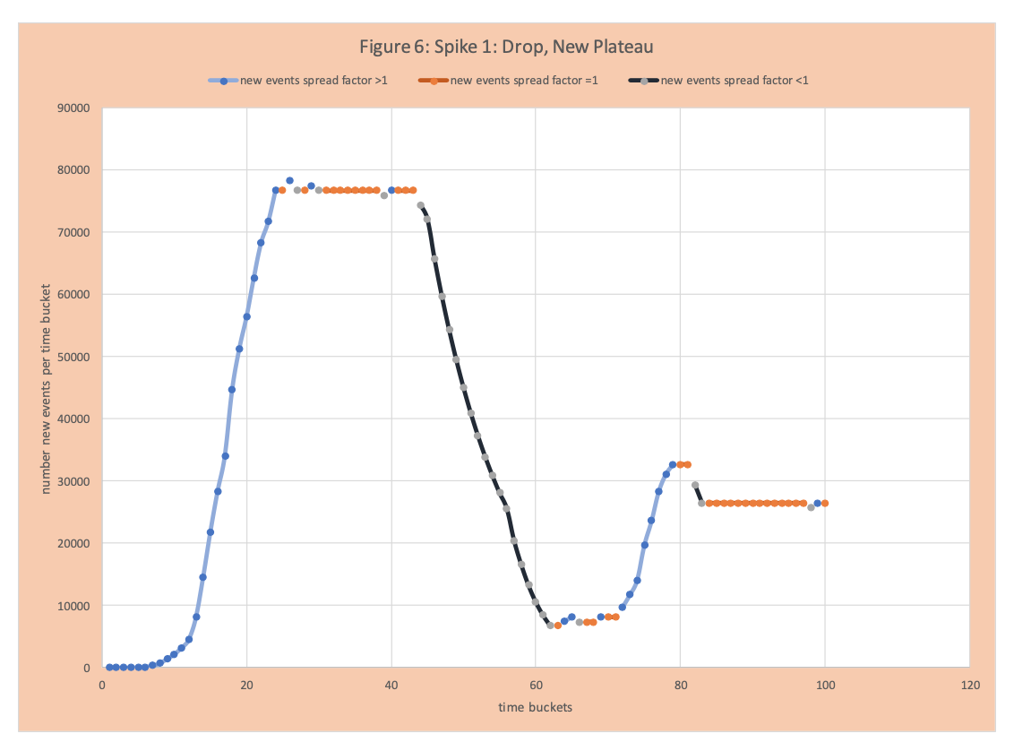
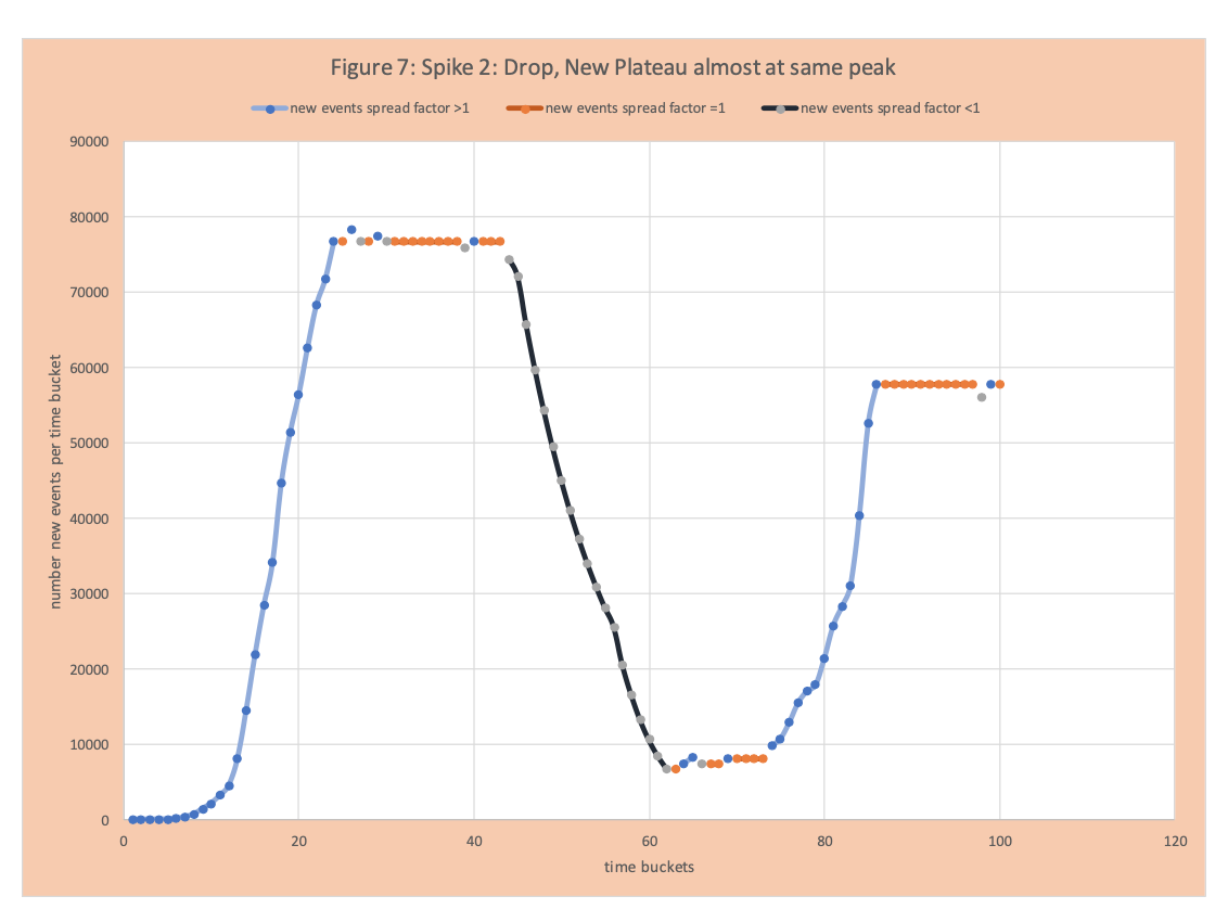
Inevitably, since there are some COVID-19 positives in the population, there will be a spike. Figure 6 shows a spike, then a reduction, and then a new plateau not much higher than the first plateau. Figure 7 shows a dramatic spike up and plateauing close to the original high point.
How do we avoid the situation in Figure 7 – that is sustained suppression of COVID-19, while loosening some aspects of mitigation.
- Understand the effectiveness of each mitigation strategy. For example, “6 feet apart” appears to be a key one. This might result in limiting the number of riders on public transportation and maintaining spacing in stores and restaurants.
- Rapid and effective ability to test if a person is COVID-19 positive (antigen test).
- Rapid and effective ability to assess immunity (antibody).
- Continuous testing and re-introducing case management. This requires enough resources in public health departments to test, document new cases, and trace from a positive case to find its potential and those that have been in contact with the new positive.
- Determining the likely spread of the virus from boxes and other surfaces.
- The details of people who are COVD-19 positive, but never show any symptoms.
- A better understanding and ability to handle the cluster nature of transmission. The spread factor is an average value. Some COVID-19 positives do not pass the virus to anyone else; others may spread it to 15 people. This distribution is critical to successful mitigation.
Elimination
The methods deployed to date described in the previous section do not eradicate the virus. This comes with the creation of a vaccine and potential treatments.
Conclusion and Additional information
The purpose of this blog was to provide an easy to follow example of the APEX curve and core concepts. A primary focus was to relate policies and actions to the spread factor (R0) and discuss actions that will help with successful rollbacks of some mitigation actions generating a partial return to normal.
Enjoyed this post? Subscribe or follow Arkieva on Linkedin, Twitter, and Facebook for blog updates.
References
Why the Coronavirus Has Been So Successful
The Deceptively Simple Number Sparking Coronavirus Fears
The Best Hopes for a Coronavirus Drug
How a Premier U.S. Drug Company Became a Virus ‘Super Spreader’
You’re Likely to Get the Coronavirus
COVID-19 Analysis and Policy Implications
Coronavirus and Analytics: Flattening the Curve
I Used to Run the C.D.C. Here’s What It Can Do to Slow This Pandemic.
Will an Antibody Test Allow Us to Go Back to School or Work?
Nearly 2,000 Dead as Coronavirus Ravages Nursing Homes in N.Y. Region