In this series of blog posts, we have been talking about Jane who is in the role of inventory planner at her company. Kate, who is a consultant, has been helping Jane with the concepts. Catch up by reading part 1, part 2, part 3, part 4 and part 5.
Kate said, “Let us now look at this data a different way. Let us plot the different frequencies as columns, something we call a histogram.”
Jane took the first data set and plotted it as a histogram. Kate asked her to look at the two charts side by side.
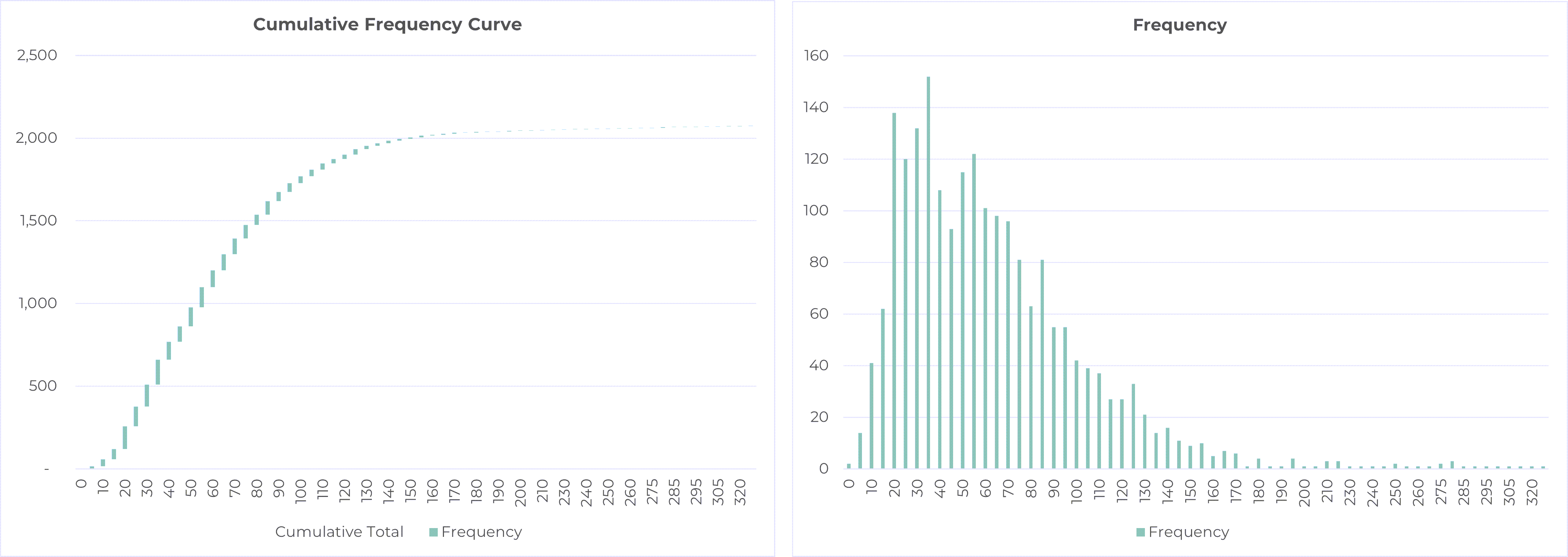
Click to enlarge
Kate asked, “Does that second chart remind you of anything?”
After Jane replied in the negative, Kate said, “Let me add some data points to make it a bit more symmetrical with a tail on the left side. Let us draw a line at the top. Does this remind you of anything?”
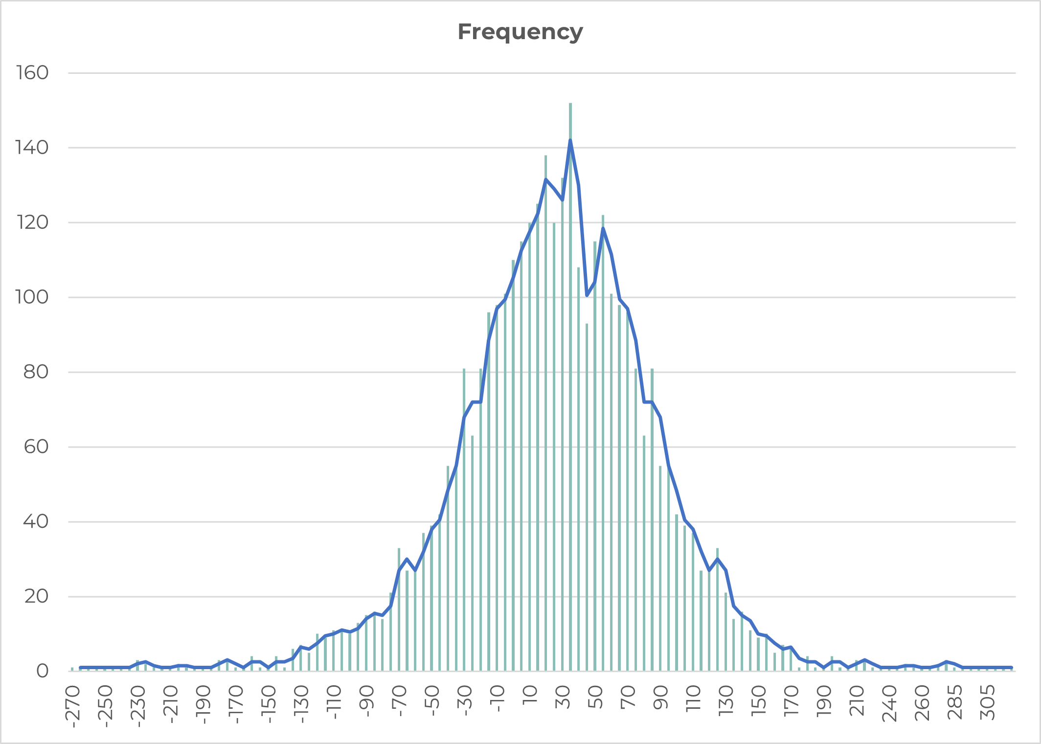
Click to enlarge
Jane said, “This looks like someone drew the bell curve with very shaky hands. Is that what you want me to see in this?”
Kate said, “You are right. Bell curve is often drawn as a line, and people forget that it is in fact a histogram. By the way, the reason it looks drawn with a shaking hand is that we are dealing with real data which is noisy. And the reason we do not have the tail on the left side in our data is because the minimum sales value is 0. There is a natural boundary on the left.”
Kate continued, “Can you do this side-by-side comparison for the other product?”
Jane pulled up the two graphs.

Click to enlarge
Kate said, “If I did a similar extending of the data on the left-hand side, could you see it coming close to resembling a bell curve?”
Jane nodded in agreement.
Kate continued, “Now this bell curve is also known as the Normal Distribution as well as the more official Gaussian distribution. It has some very nice properties that make it very popular in many calculations including safety stock calculations. This of course does not mean that all underlying data is normally distributed. However, that is a more detailed discussion. For now, let us go along with the idea that our data is normally distributed. Remember when you were asking me about the service level? Let us see that in the context of a normal distribution.”
“If you look at this picture, I am showing that one has decided to keep enough inventory to satisfy demand up to the beginning of the red zone. This means, if the level of demand is at points A, B, or C in the picture, there is no problem. The service level will be 100%. However, if the demand level is at points D, E, or F, then I will not be able to meet all that demand. In fact, I will have a stock out. Even though F > E > D, I evaluate these to be the same result: a stock out. Therefore, I give myself a score of 0% for service level. This is not very different from what we saw earlier; earlier, we were looking at real data whereas now we are looking at theoretical normally distributed data.”
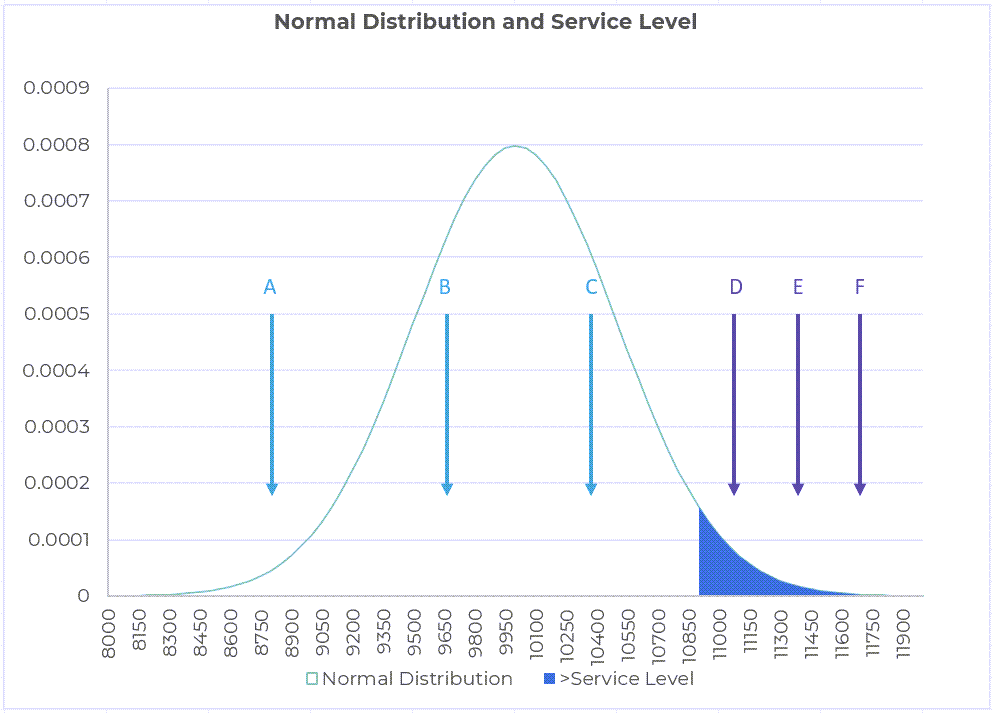
Click to enlarge
“We only need the standard deviation to calculate safety stock using the normal distribution. Well, that and the z-score,” Kate said.
“What is this z-score?” Jane asked.
“The z-score tells us how many standard deviations we are away from the mean which is the middle of the bell curve” Kate replied. “For a particular service level, one can get this z-value from a table, which is rather convenient. If I want to have a 90% service level, I look up the appropriate z-score, multiply it by the standard deviation of demand during the DDLT, and I have the safety stock. Incidentally, we call the standard deviation of demand during the lead time as σDDLT.”
“So, in this example, the mean is 10,000 and the standard deviation is 500. If I wanted to achieve a service level of 90%, then I would need to look up the z-score for 90%, which incidentally is 1.645. So, the safety stock I would need to provide a service level of 90% would be 500*1.645 = 822.5. This would mean a total inventory of 10,000 (to cover the usual or the average or the mean demand) + 822.5 or 10,822.5 units.”
“You will remember that the safety stock for 90% in our previous example (here) was more than 2 times the inventory for the mean or the 50% case. Here the ratio is much smaller, only about 108.2%. This is because the standard deviation is quite small”.
Jane asked, “So the safety stock will go up if the standard deviation goes up?”
“Yes,” Kate replied. “Also, if the service level goes up the z-score will be higher. Safety stock will also be higher if the lead time is longer. In fact, in my calculations above, I assumed that the standard deviation was calculated over lead time. However, often the standard deviation is available for the daily demand. In that case, the formula for safety stock needs to incorporate the lead time. As in, Safety stock = z-score*σDay*√L, where L is the lead time. Multiplying σDay by √L, or to be more precise, √(L/1), converts the daily standard deviation to the standard deviation over the lead time or σDDLT.”
“In fact,” Kate continued, “The formula is better expressed in terms of the square of the standard deviation which is also called the variance. The safety stock = z-score *√[σDay2*(L/1)].”

Read the next post in the series here.