You have a favorite forecast accuracy metric(s) you’ve been practicing within the organization for a while, and now you think you are ready to bring it to the Sales and Operations Planning (S&OP) meeting as a Key Performance Indicator (KPI) of your demand planning process. But you are not sure exactly how to go about reporting forecast accuracy to the attendees. In this post, I will address this question.
As one of my clients Paul puts it: When it comes to metric reporting at S&OP, the key is to keep the metrics simple, show the trend(s) over time, and then be able to drill into the details so one can chase down the issues to improve the metric. To me there is a lot of wisdom in those words. Let us take his ideas one at a time.
Keep it simple:
This is important because executives typically do not have an in-depth understanding of forecast accuracy metrics. Therefore, it is key to pick a metric that they can easily grasp and base decisions on. This is probably the reason metrics that report percent errors are very popular. From this point of view, Mean Absolute Percent Error (MAPE) is a good one to consider. I have written about MAPE here and here.
There is a second part to keeping it simple. The metric needs to be at an aggregate level. Think about it this way: If your business has 4000 products, you are not going to report 4000 accuracy numbers in your S&OP meeting. What you want to do is present the metric at an aggregate level. For this reason, I am a big advocate of using Weighted MAPE. (I wrote about WMAPE here.) You do not have to report just one number however. You may break it down by product families or other criteria as you see fit.
Show the trends:
Showing the trend also has two parts. The first has to do with BIAS, (see here): the tendency to consistently either under or over forecast. If such a tendency exists, management might benefit from becoming aware. They might also be able to drive change in the forecasting process so BIAS can be eliminated.
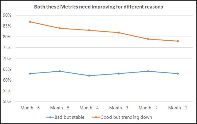
The second part of this has to do with how the metric is trending over time. As Paul puts it: Most people get tied up in one number but do not see where the process (metric) is headed over time. A very good score that is trending downwards over time should still be a cause for concern. Any consistent downtrend should be see a turnaround as quickly as possible.
As you can see in the below graph, the forecast accuracy metric in orange, though much better than the one in blue, should still cause concern because of its consistent downward trend.
Drill down to details:
Once the above is incorporated into the KPI design, one must be aware of the need to drill down to lower levels so they can effectively figure out where they need to act in order to improve the metric. For example, a business might have a 70% overall forecast accuracy. However, upon drilling down, one might see most of the errors are coming from one-or-two product lines. If this is the case, it is obvious where the energies should be applied in order to make improvements.
There is another reason for being prepared with the drill down: It simply is never the case that a knowledgeable business team does not challenge the numbers presented to them. So, very often, they will look at a KPI and ask the S&OP coordinator to show the numbers behind the numbers. Being prepared to do the drill downs goes a long way in institutionalizing the metrics in the S&OP process.
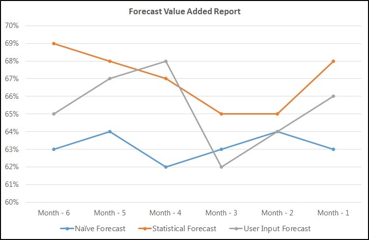
A slightly different type of drill down comes from the concept of forecast value added (FVA) from Michael Gilliland. (Source: Gilliland, M., (2013), Forecast Value Added: A Reality Check on Forecasting Practices, Foresight, Issue 29 (Spring 2013), 14-18.) In the original paper, Gilliland succinctly describes how forecast from different groups of people is only useful if it makes the forecast better by adding value over the previous step. While he does not call it a drill down in his paper, I think of it as such in the context of an S&OP meeting. A drilldown report shown during the S&OP can easily show who is improving the forecast and who is making it worse. It might look like the following. As you can see in this contrived example, the user input forecast is actually taking away the value by making forecast accuracy worse.
These are the three steps I would incorporate in my slide deck to report forecast accuracy to the management team at an S&OP meeting. If I was starting up, I would begin with the first step and work towards the third one.
Do you report forecast accuracy during your S&OP meeting? If so, how? I am interested in learning from you.
Like this blog? Follow us on LinkedIn or Twitter and we will send you notifications on all future blogs.


