Summary:
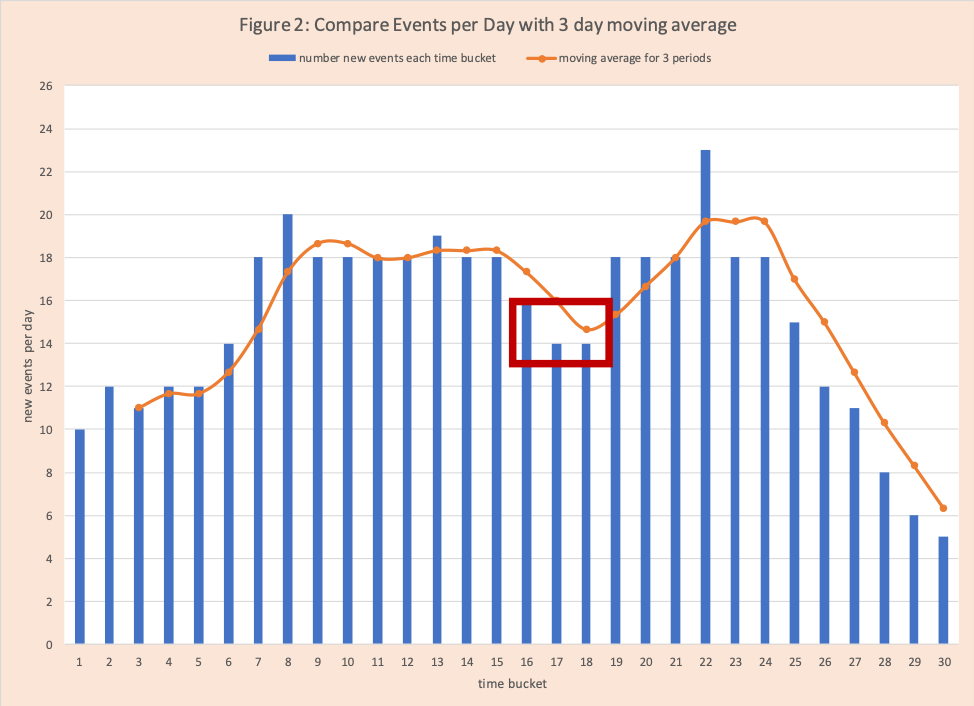
We see graphs of COVID-19 events on a regular basis. One of the most common is a bar chart for daily new events (COVID-19 cases, hospitalizations, deaths). Recently in presentations from government leaders the variations in day to day numbers have been noted as weak and smoothing methods are being employed. The two primary methods used are a moving average and finding the average for a group of days. The purpose of this blog is to shed some light on these methods and introduce another helpful method to see trends called First Order Difference (FOD). This light has two components: an easy understanding of the mechanics of these methods and recognizing they do not change the story in the data. They can be helpful for visualization but they can also hide important questions to ask. Combining them can be a powerful visual (Figure 2). Previous blogs have covered the basics of rapid growth and the impact of social distancing and the Apex curve. This blog is part of Arkieva’s COVID-19 commitment. Future blogs will cover Common Lessons for COVID-19 and supply chain management, including models, data, and risk and supply chain challenges to support effective recovery and normalization of economic activity.
Example
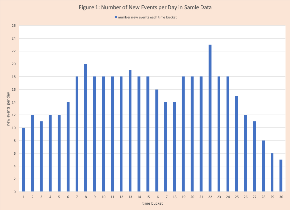
Table 1 has our sample data. We have 30 days (time buckets) of observations. Column 2 has the number of events per day. Day 1 has 10 events, day 2 has 12, day 30 has 5. These are displayed in Figure 1.


Column 3 is a three-day moving average. This is a common method used in forecasting and data analysis. The number of days can be any integer. Here we use three. This method averages the value for the current day with the prior 2 days. On day 3, the value is 11 = ((10+12+11)/3). Observe there are no values for days 1 and 2 (posted at #NA). On day 30 the value is 6.33 = ((8+6+5)/3) = (19/3). Figure 2 has a graph of the daily events (blue bar chart) with the 3-day moving average (orange scatter plot). Observe the 3-day “smooths” highs and lows while attempting to capture the basics flow (increasing – up, flat – straight, and decreasing – down). Note for a rapid up the 3-day lags (is below) the daily numbers generating a risk that you don’t catch the upswing in time. For a rapid down the 3-day often also lags. Visually the two combined help the analyst see trends and ask the right questions. For example, days 16-18 (in the red box in Figure 2) have a substantial drop that is not sustained which raises a question. This is where community intelligence is very helpful. There might have been a data collection issue or there were no cluster outbreaks (nursery homes or over 55 communities for example).

Read More: IOT and Digital Enterprise Move Over – The Next Wave: Community Intelligence
Column 4 is the “three-day group average”. In this method we group every three successive days, find the average and use this value. For days 1 and 2 there are no values (#NA), day 3 is the average of days 1, 2, and 3 which is 11= (10+12+11)/3. There are no values for day 28 and 29, but day 30 is 6.33 = (8+6+5)/3= 6.33. Observe this group average is a subset of the moving average values – every third day is used. Figure 3 displays the three-day group with daily data. As you would expect it tells a similar story to the 3-day moving average.

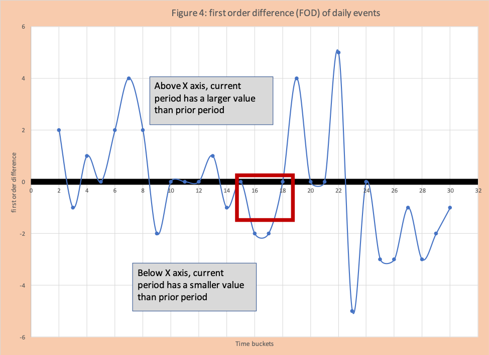
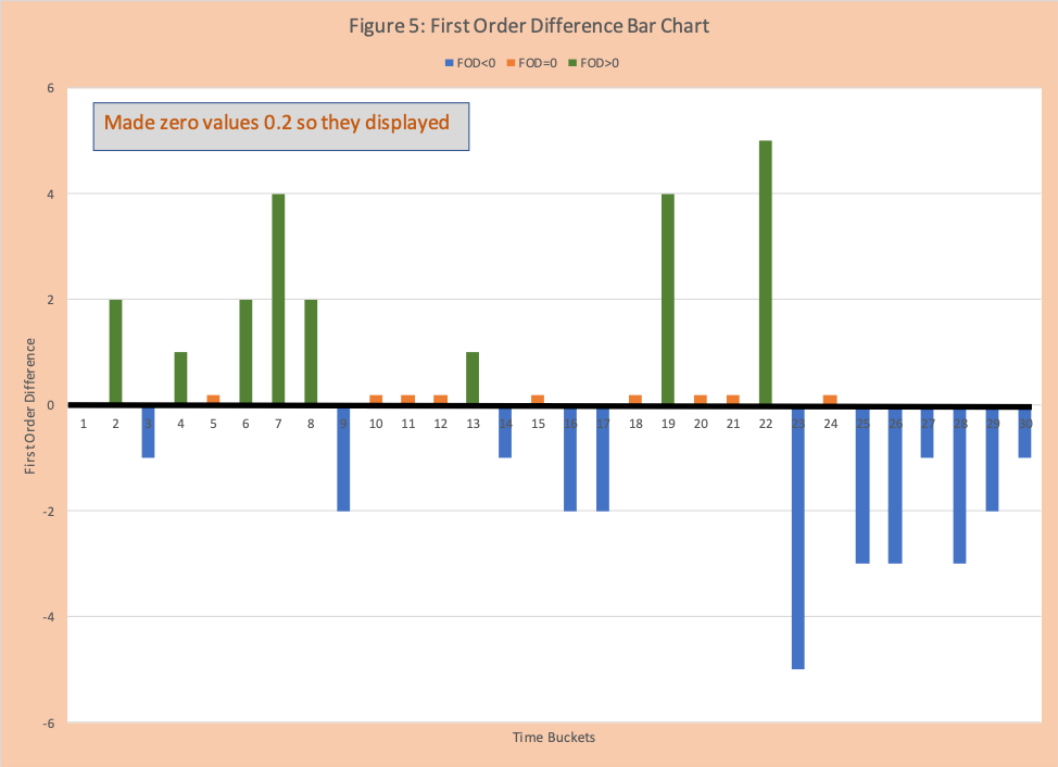
Column 5 is the first-order difference (FOD) which has not been used often in COVID-19 discussions, but it is a staple of industrial-strength statisticians and very helpful for analysis. It is defined as the value for the current day minus the value for the day before. For day2 the value 2 = (12-2). For day 30 the value is -1 = (5-6).
- If the value is positive the number of events increased
- If the value is 0, then no change
- If the value is negative, the number of events decreased
Figure 4 has a scatter plot graph of the FOD. Figure 5 has a bar chart where increases are green, stay the same are orange, and decreases are blue. These graphs make it clear where there are clusters or groups of increases (for example days 4 to 8) and decreases (for example days 25 to 30).


Conclusion
The trade-off between working with detailed data and summary data has existed since the dawn of time. In this blog we provide the basics of two summary methods and helpful transformation called first-order difference. We see that combining details and summary on the same graph makes for a very powerful visual summary.
Enjoyed this post? Subscribe or follow Arkieva on Linkedin, Twitter, and Facebook for blog updates.


