In a previous blog “Balancing Cash Cost and Service: The Supply Chain Triangle” we have introduced the idea that supply chain management is all about balancing three corners of a triangle: cash, cost and service. We have also discussed that in many companies we see a lack of alignment between the three corners. Sales tries to increase service to sustain top-line. Operations will focus on cost. Finance will put the pressure on working capital. Without alignment companies stay stuck in the middle. Seek for alignment when setting targets. Ensure continued alignment by sharing inventory turns as a KPI.
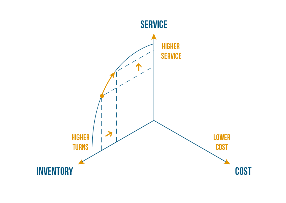
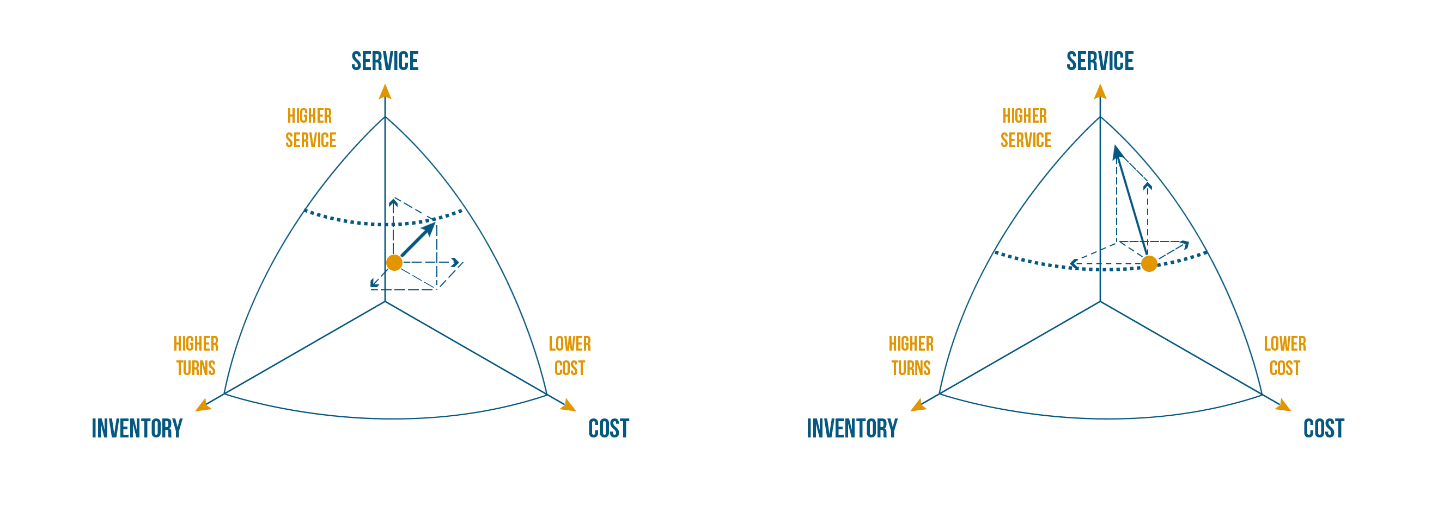
In this blog we will take the Supply Chain Triangle into 3 dimensions to explain the concept of the “best practice frontier”. We will start by plotting that frontier per 2 dimensions. Figure 1 shows it for inventory and service. The idea is that more service, typically comes with a higher inventory (or lower turns). Examples could be:
- Shorter lead times
- Higher fill rate
- Broader product portfolio
They increase the service but require a higher inventory.
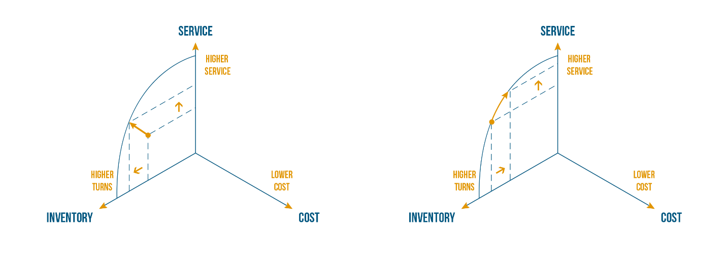
In fact, as is illustrated in Figure 2, companies that are not yet on the best practice frontier, can still improve on both dimensions at the same time; i.e. both reduce inventory (increase turns) and improve service. The true trade-off between either higher turns or higher service is for the companies that have reached the best practice frontier. The leaders will try to continually shift the best practice frontier to escape that trade-off. The laggards can improve on both dimensions by adopting best practices. An example can be refining the safety stock calculations and adopting a stochastic inventory optimization.
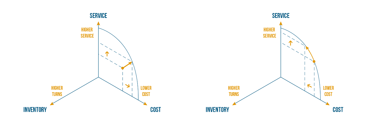
There is a best practice frontier for inventory-service, and there is one for cost-service, as illustrated in Figure 3. In general, increasing service comes at an extra cost. If we assume a fixed inventory, a higher service could come from ‘excess’ or so-called ‘sprint’ capacity, that allows to react quickly to unpredicted demand. We may also choose to fly material instead of using slower transportation like rail or truck. These examples reduce lead times, improve agility and as such service, but they come at an extra cost. Companies that are not yet on the best practice frontier can again improve on both dimensions at the same time. The true trade-off only occurs at that best practice frontier.
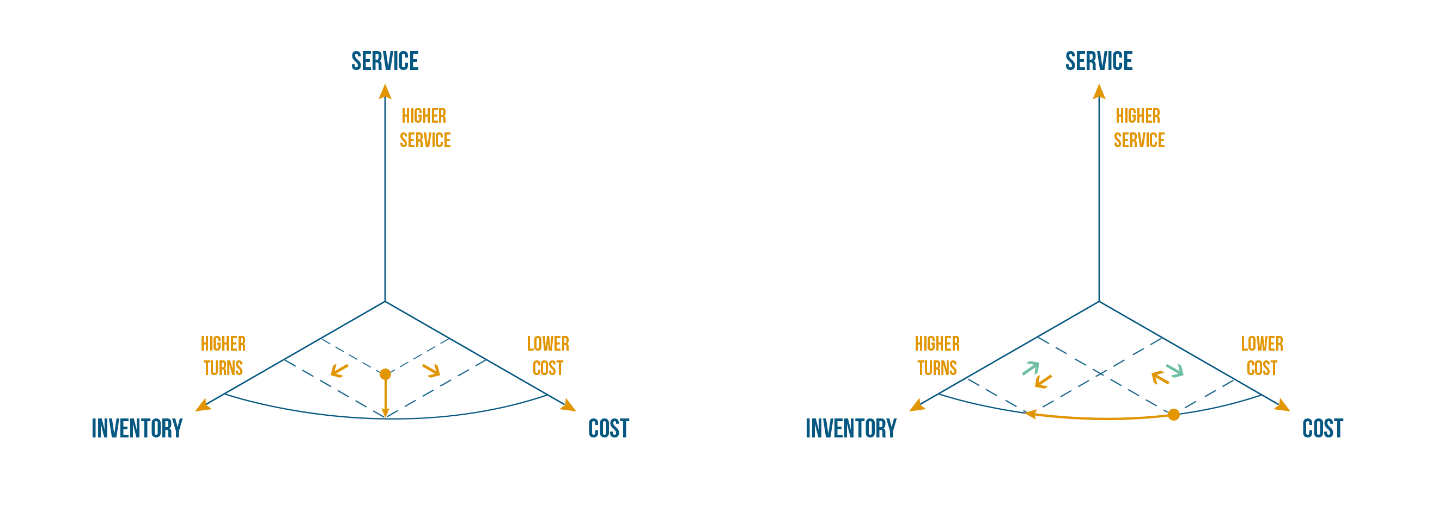
Figure 4 shows that inventory can be substituted by cost, and vice versa. I can increase turns by paying extra to my suppliers. They may be happy to deliver more frequently or give some consignment. Cfr. the red arrow in Figure 4. On the other hand I can reduce my cost by increasing batch sizes in production or MOQ’s in procurement. It will lower cost but increase inventory or decrease turns, cfr. the green arrow on the right in Figure 4.
As before, companies that have not reached the best practice frontier can typically improve on both dimensions at the same time. This is illustrated on the left in Figure 4.
If we follow the 2-dimensional story, where we consider the best practice frontier per 2 dimensions, assuming the third is constant, we can easily extend the reasoning to 3 dimensions, as illustrated in Figure 5. In 3 dimensions the best practice frontier shows as a best practice ‘surface’. If we are below the surface, we can improve on all 3 dimensions at the same time. Once we are on the surface, we try to shift the surface, but in the short term, we may need to sacrifice at least 1 dimension to improve on another.
Using Orbit Charts to Benchmark EBIT versus Inventory Turns
In her excellent book ‘Supply Chain Metrics that Matter’ (Cecere, L.M., Supply Chain Metrics that Matter, John Wiley & Sons, 2015), Lora Cecere shows how we can reveal the ‘best-practice-frontier’ using so-called ‘orbit charts’. She also couples it to an elegant discussion on the need for strength, balance and resilience.
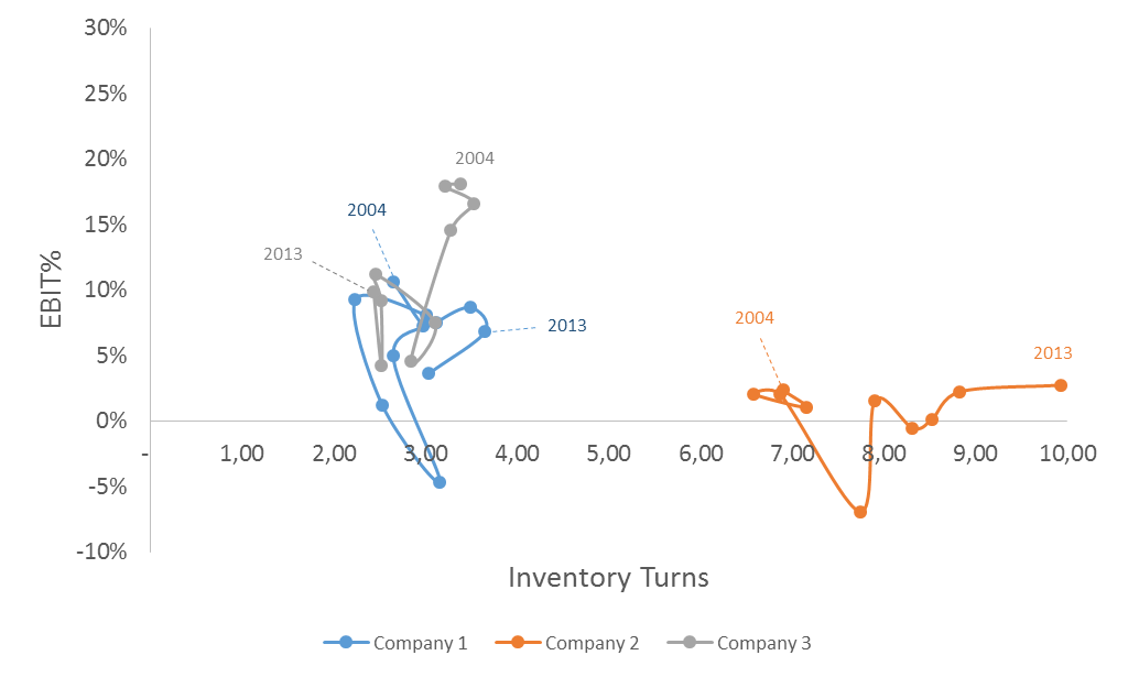
Figure 6 shows an orbit chart for 3 competing technology companies. On the X-axis we show the Inventory Turns, on the Y-axis we show the EBIT as a % of Net Sales. Each dot represents a year, we track the evolution of the 3 competitors over the last 10 years.
The EBIT combines the ‘service’ and the ‘cost’ dimension of our Supply Chain Triangle. Service is a driver for Revenue so that’s accounted for in the EBIT. The costs accounted for in the EBIT are the ‘cost of goods’, the so-called ‘selling general and administrative’, any depreciation and amortization of R&D expenses, former investments in fixed assets, …
Instead of using ‘Inventory Turns’, one could also use the ‘Cash Conversion Cycle’ as a more general measurement of the ‘Cash’ side of the Supply Chain Triangle.
Instead of using EBIT, one could also use EBTIDA, gross profit, net profit, … as a combined measurement over the service and the cost axis in our Supply Chain Triangle.
Looking at Figure 6 we can say that company 2 shows ‘strength’ in Inventory Turns but it is ‘unbalanced’. It has an average EBIT% of 0.68% which seems below standard. Company 3 has a better balance between Inventory Turns and EBIT%, however it lacks resilience. It took a hit from 2007 to 2008, most probably because of the financial crisis and it never recovered. Compared to Company 1, which also took a hit because of the crisis but they rebounded in 2010, 2011 and 2012 to get back to their pre-crisis EBIT% with higher inventory turns. Performance in 2014 has fallen back.
In summary, as an investor, I’m looking for strength, balance and resilience. Each market is subject to disruption sooner or later. I might not see it coming. As a result resilience is probably the highest good.
Extending “Orbit Charts” to Reveal the “Best Practice Frontier”
Company 2 ‘seems’ out of balance in Figure 6. We need to be careful when drawing conclusions. When comparing Companies 1, 2 and 3, the real measure should be “what’s the EBIT generated per inventory dollar”. It is OK that the EBIT is lower, as long as the EBIT per inventory dollar is higher.
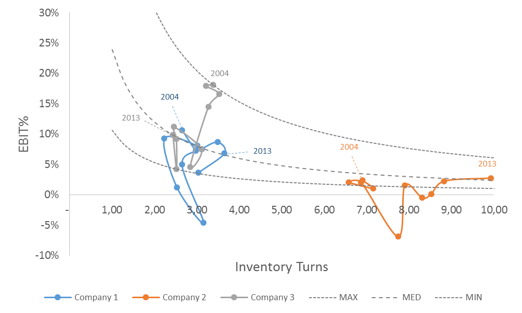
Figure 7 shows the Minimum, the Median, and the Maximum EBIT per invested dollar curve for Company 1. From the last 10 years, we have picked the year with the highest EBIT per inventory dollar, the lowest and the median. For those years, we have shown which other combinations of EBIT and inventory turns would have led to the same EBIT per inventory dollar. As a benchmark from our own history, we can already say that any combination on or close to the MAX curve is a good one. If we did it, we can do it again.
From Figure 7 we see that Company 2 is in line with the Median performance of company 1 over the last 2 years. That may be a surprising fact if you just look back to Figure 6!
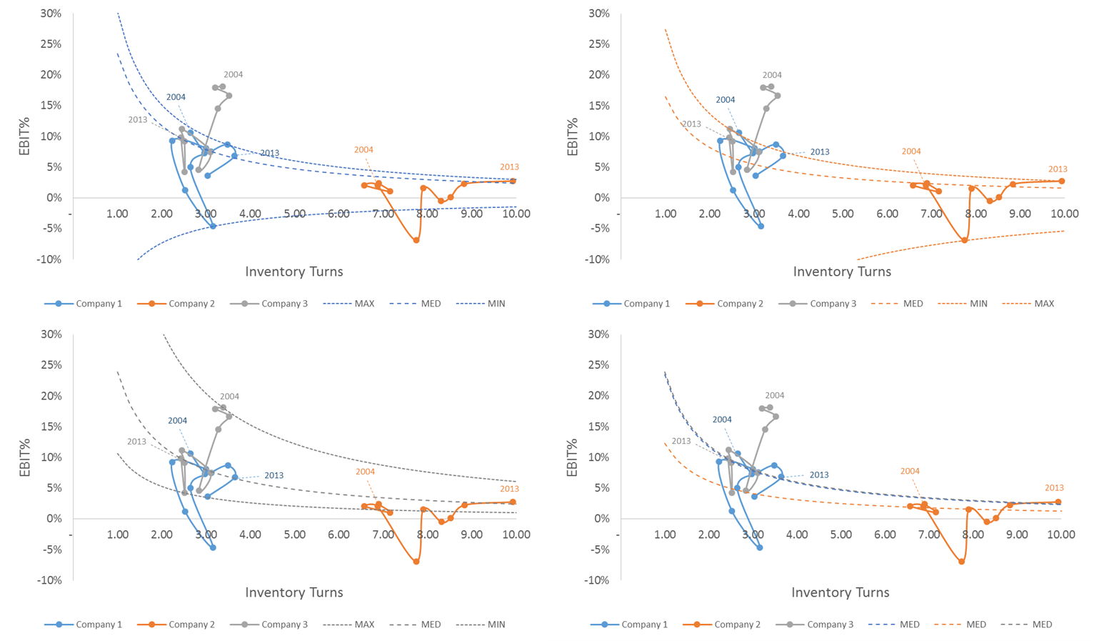
Figure 8 shows the Min, Median and Max curves for Company 2 and Company 3 as well. The bottom right chart compares the Median curves for companies 1, 2 and 3. We see that the median performance of Company 1 and 3 is comparable. The 10 year median performance of Company 2 is well below that of Company 1 and Company 3, though in the last 2 years it seems to have caught up.
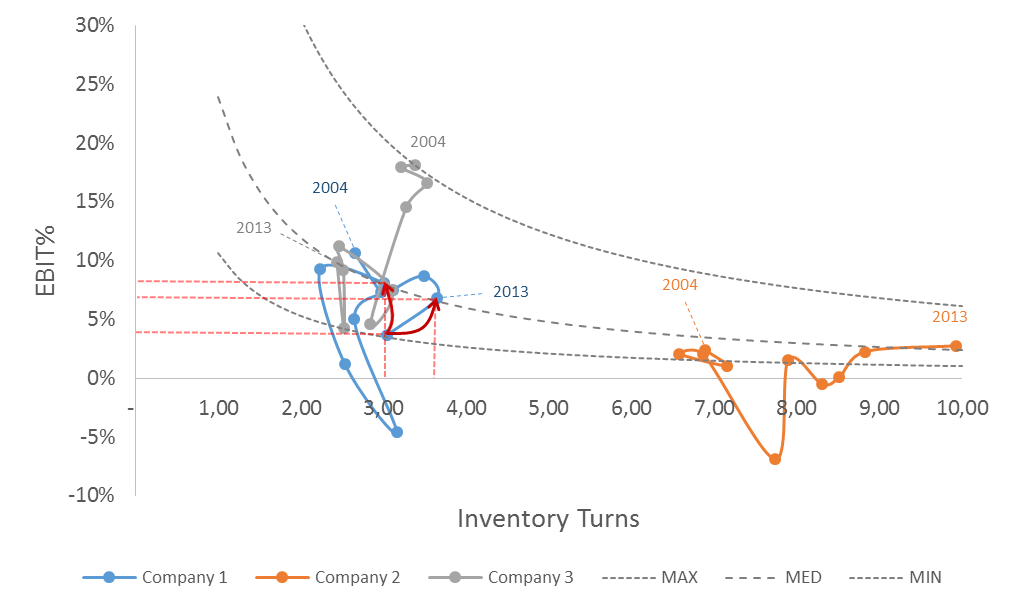
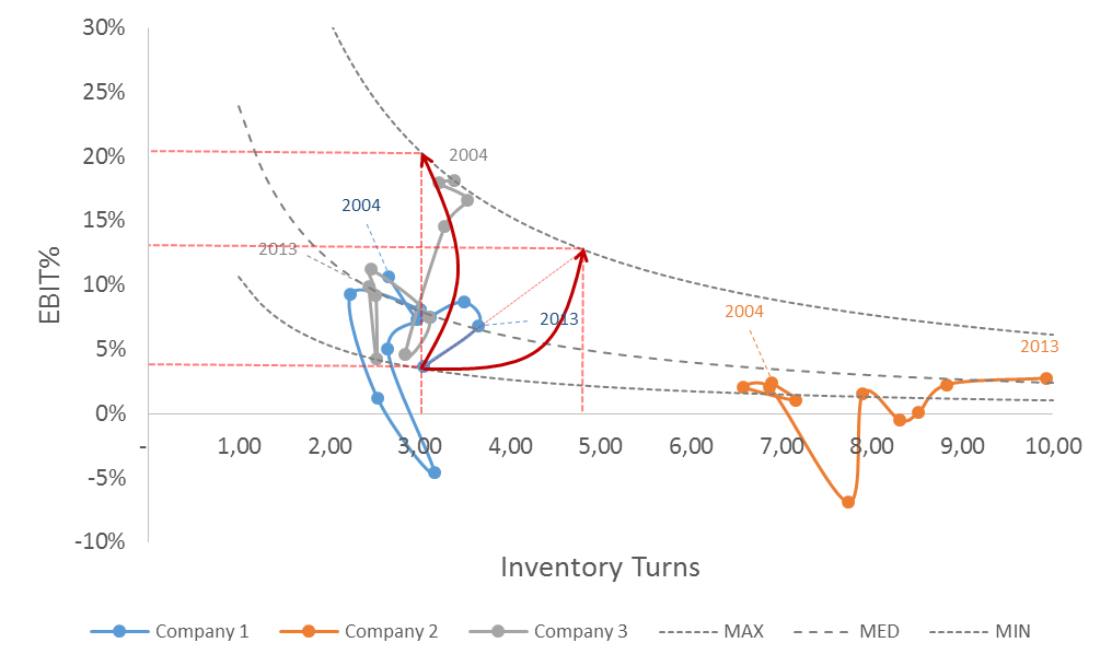
What is now the ‘Best Practice Frontier’ and what should be our target for Company 1? Well, as shown in Figure 9, Company 1 should at least be going back to its Median curve in 2015, being
- Either return to turns of around 3.75 for an EBIT% of around 6%
- Either boost EBIT% back to 8% if inventory turns stay around 3
Considering the pre-crisis performance of Company 3 as the ‘Best Practice Frontier’, the more aggressive targets for Company 1 are to
- Extend the turns from 3.75 to around 4.75 for an EBIT% of around 13%
- Either boost EBIT% to 20% if inventory turns stay around 3
These targets seem overly aggressive but Company 3 has been close to that performance for 3 consecutive years. A detailed analysis of how they did should reveal opportunities for Company 1 to shift in that same direction.
The 2 options also seem to go in quite opposite directions. As we will introduce in a next blog, we believe the choice of direction is one of the choice of strategy.
In conclusion, inventories and profitability go together. That was the conclusion of our search for the ‘best practice frontier’ in our Supply Chain Triangle. That’s also the conclusion of the benchmarking using the Orbit Charts. In many companies we see that targets for inventory turns are set ‘in isolation’. It’s another sign of the ‘lack of alignment’ in the Supply Chain Triangle we also described in our previous blog. We hope that by the method described in this blog, companies will perform a different type of benchmarking and come to more aligned target setting in their company.
