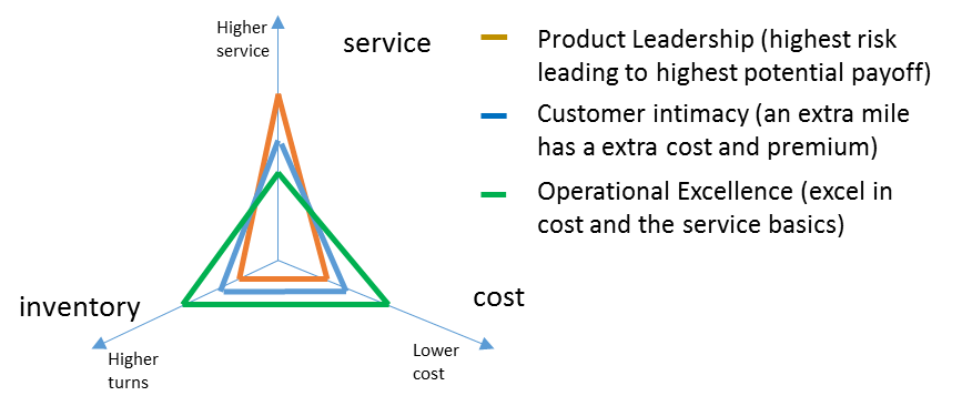
In our previous blog “Linking the Supply Chain Triangle to Strategy”, we have shown how we can map the 3 strategic options proposed by Treacy & Wiersema to the Supply Chain Triangle. We’ve recaptured the result in Figure 1.
A next logical question is if we can somehow capture this from publicly available financial data and benchmark companies on this strategic level. Inventory turns are available. What about service and cost?
Analyzing differences in Gross Profit and R&D Spending using Orbit Charts
As we’ve also argumented in our previous blog, we expect a product leader to have the highest spending on R&D. His business model is driven by innovation. Being the first on the market and having the best product, should also lead to a premium. Many technology companies give data on their R&D expense in their financial reports. To check whether that leads to a premium, we can analyze the ‘Gross Profit’ from the financial reports. The Gross Profit shows the Net Sales minus the Cost of Goods Sold. The Cost of Goods, also called the Cost of Sales, include all costs of purchase, costs of conversion and other costs incurred in bringing the inventories to their present location and condition. If the product leader drives a higher premium from his customer, he should have a higher gross margin compared to his customer intimacy or Opex colleagues.
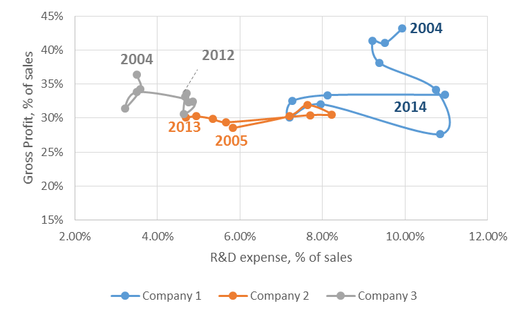
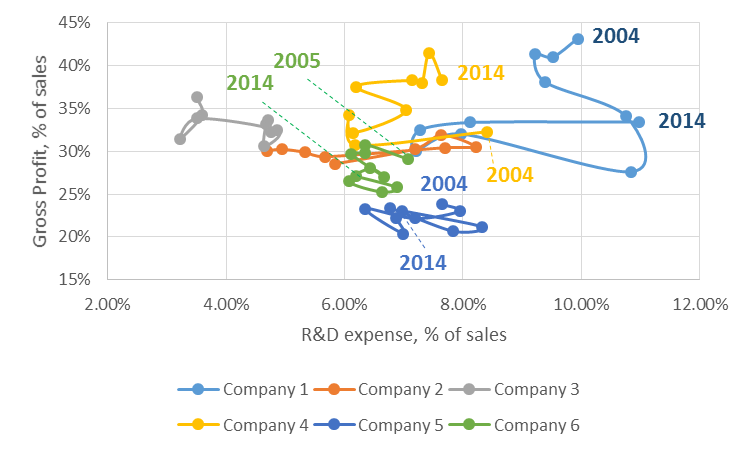
Figure 2 analyzes the R&D spending versus the gross profit for our 3 technology companies. We notice there is a big difference in R&D spending. Company 1 ranges from 7 to 11%. Company 2 from 5 to 8%. Company 3 from 3 to 5%. If Company 1 were to be a product leader, that higher R&D spending should translate into a higher gross margin. From Figure 2 we see that has been the case in the pre-crisis period 2004 – 2007. As gross profit has come down during the crisis and did not fully recover, we see that Company 1 has been cutting its R&D spending. However, the R&D spending remains high compared to the spending of Company 3, which has comparable gross profit levels. Company 3 has been increasing R&D spending. Company 2 went up and down, doesn’t show a consistent pattern.
Analyzing differences in Gross Profit and SG&A Spending using Orbit Charts
As we’ve mentioned in our previous blog, we expect a product leader to have a higher spending on Sales and Marketing as well. You can have the best product in the world, if potential clients are unaware it will be left unsold. Again, the premium derived from the product (the higher gross profit), should allow for the higher spending on Sales & Marketing.
In financial statements, sales costs and marketing costs are typically not mentioned separately but under a more general umbrella called ‘Sales, General and Administrative’ or ‘SG&A’. When benchmarking SG&A it is crucial to verify whether that includes or excludes the R&D costs. If the R&D costs are not mentioned as a separate line, they are typically included in the SG&A in the consolidated Profit & Loss. You will most probably find the R&D costs mentioned separately somewhere in the financial report. By subtracting them from the SG&A you can come to the SG&A excluding the R&D costs.
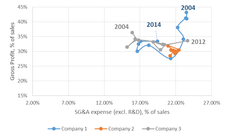
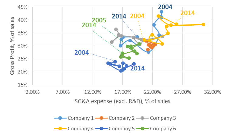
Figure 3 shows the SG&A excluding R&D versus gross profit for our 3 technology companies. Though the 3 companies seem more in line, notice the big range of the spending, from 15% to 23% which is an 8% difference! As gross profits for Company 1 have declined, during the crisis period, we see the company has been reducing the SG&A spending. Company 3 has been increasing the SG&A spending. Company 2 has remained relatively stable.
Analyzing differences in R&D and SG&A Spending using Orbit Charts
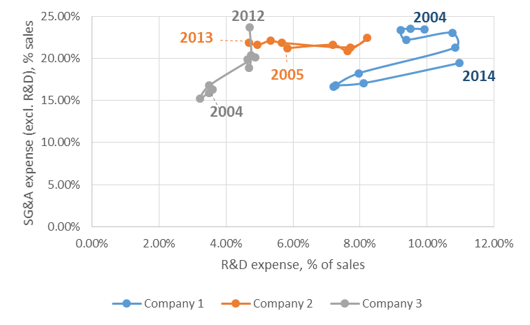
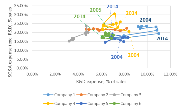
In our discussion so far we’ve assumed that a product leader would have both high R&D and SG&A costs. Figure 4 shows the combined graph of R&D expense and SG&A expense (excl. R&D).
Figure 4 shows company 3 driving up spending on both Sales and R&D, for the same gross profit, so at the expense of EBIT. That could be an attempt to reach that product leadership position. If it goes to the expense of EBIT, it’ll be important that investors support this strategy.
It shows Company 2 is relatively flat on sales but oscillates on R&D spending.
Company 1 is oscillating most on R&D spending. Sales spending has come down. From Figure 2 and Figure 3 we have seen that Company 1 has problems to sustain the above normal gross profit position which is typical to a product leader. In response it has reduced spending.
Extending the analysis to extra benchmark companies
To get a good view on the industry, we typically want to expand this analysis to extra companies. Figure 5 and Figure 6 again show the same figures but for an extended set of benchmark companies. Company 4 is a noticeable exception in that it manages to increase gross profits in the 40% direction. As of 2005, it uses that increased margin to increase R&D spending (cfr. Figure 5) and to increase sales spending (cfr. Figure 6). Company 5 has more or less stable gross profit (though it is the lowest in the benchmark). You can see that over the 10 year period it has decreased R&D expense in favour of SG&A. Company 6 sees a decreasing gross profit and cuts in both R&D and SG&A expense.
