Summary
A reoccurring challenge in comparing and combining diverse time series in demand forecasting is the “scale” (significant variations in magnitude and spread) – as it is in combining metrics. Rescaling is a powerful but simple method to help with this issue enabling demand planners to focus on similarities of shape. This blog provides an example of one method called normalization.
Introduction
The blog “How to Combine Diverse Supply Chain Metrics” tackles the critical question of how best computationally to combine metrics or KPIs and makes clear the importance of the geometric mean to avoid data-driven disasters. From my experience, even with the geometric mean, combining metrics without thought to the business situation can be a road to disaster. A related challenge occurs when we need to compare or combine diverse time series to understand the time series shape and potential predictive relationships. We turn to tools of the trade for data analytics. This blog will explain a simple, but effective method – rescaling or normalizing – working a sample data for umbrella sales history.
Umbrella Sales
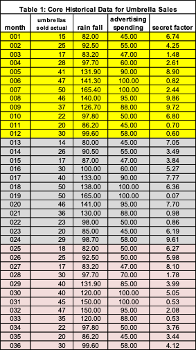
The business need is to estimate umbrella sales for the next 12 months for a marketing area. The historical data available (Table 1) is 36 months of sales, rainfall, advertising spending, and a secret factor. The demand analyst believes the “secret factor” is critical to demand estimation. Table 2 has the arithmetic mean (average) and standard deviation for each variable (sales, rainfall, advertising spending, and secret factor). Observe a large difference in these values.


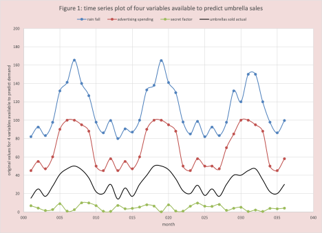
A first step is often to plot all 4 variables which is done in Figure 1. The relationship or potential similarity in shape is not obvious since each variable has a different scale (magnitude and spread). What can we do? Rescaling to the rescue.

Rescaling
We can use a rescaling method called “normalization” to put every variable on the same scale.
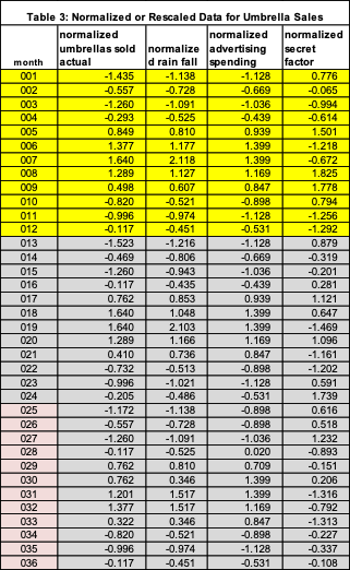
First, we calculate the mean and standard deviation for the original variables (Table 2). To get the rescaled value we subtract the mean from the original value and then divide by the standard deviation. These values are posted in Table 3. Example calculations:
- The value of -1.435 in Table 3 row month 001, column “normalized umbrellas sold” is from the calculation (15-31.3)/11.4 = -16.30/11.4. 31.3 is the average umbrella sales and 11.4 is the standard deviation of the sales.
- In the same row, normalized rainfall is -1.138 = (82-111.2) / 25.6.

For each rescaled variable, the mean is ZERO and the standard deviation is 1. This is why it is called normalized – since the standard normal has a mean of zero and a standard deviation of 1.
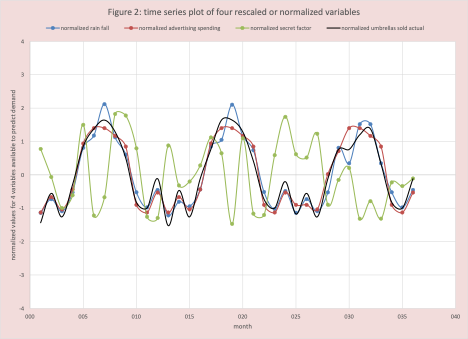
Figure 2 has the plot of the normalized values, we can easily see umbrella sales, rainfall, and advertising costs “move together”, this is not true for the secret factor.

What about the Secret Factor?
As it turns out, by itself the secret factor is a poor predictor of umbrella sales, but when it is in combination with rainfall or advertising cost it improves the estimate. The why will be answered in another blog.
Conclusion
A reoccurring challenge in comparing and combining diverse time series is the “scale” – as it is in combining metrics. Rescaling is a powerful method from the data scientist’s tool kit to help with this issue enabling demand planners to extract more from the data collected. This blog provides an example of one method called normalization.
Enjoyed this post? Subscribe or follow Arkieva on Linkedin, Twitter, and Facebook for blog updates.


