There is no shortage of folks these days who vilify all inventory. However, others and I have blogged on this and other platforms that not all inventory is bad. In fact, it is a critical component of any successful organization and serves as a buffer for uncertainty. It is a natural result of production and distribution and a critical component of an optimized central plan. In my inventory class, I often describe it as the shock absorber on your car; the supply chain road is bumpy and full of surprises, and the inventory helps you avoid the jarring impact from many if not all bumps. Of course, with the good comes the bad. It is very easy for a firm to suffer from inventory obsolescence – inventory that exists but there is not much need for it. What is referred to as OSOM – out of sight out of mind. Here are some analyses based on the Pareto principle (or as is very commonly referred to as ABC analysis) that one can do in order to determine the alignment of the inventory with the overall needs of the supply chain.
ABC analysis presents a commonsense approach to identifying mismatches. In this discussion, I am going to assume that the readers know about the ABC analysis. Typically, top 80% are classified as A, next 15% as B, and last 5% as C. Neither the percent splits nor the number of classes is etched in stone; practitioners should and do modify them to fit the business needs.
The easiest place to start is to analyze the demand data over the last few (say 12 months) and classify them into A-B-C categories. In fact, while one is at it, might as well go and do the ABC analysis at the item (or item-location) level using the following data.
- Customer Demand
- Revenue
- Margin
- Supply (Production / Purchase)
- Inventory
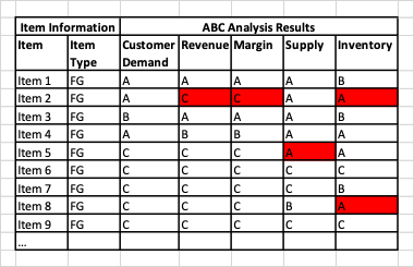
One can then list these in a table and look for the obvious mismatch. See the example below. FG in the table below means finished goods.
A word to the wise: there might not be enough spread in the margin data to do a percent-based ABC analysis. Instead, it may be advisable to do it based on cut-offs. As in: Margin higher than 15% → A; between 10-15% → B and <5% → C. Similar thought could apply to forecast accuracy measurements.

In the above example, if we look at Item 2; it is in high demand (A) but is low in margin (C) and revenue (C). The inventory is high (A). Any combinations similar to this one might warrant a second look. It should also be said that the business strategy could make this a reasonable situation to have.
Consider next item 5. It sees low demand (C), but high supply (A) resulting in relatively high inventory (A). What can be done to reduce the supply, be it production or procurement?
And how about item 8? Low demand (C), yet high inventory. What is going on here?
The above examples can be used to identify the types of things that warrant a closer look.
Learn More: Three Simple Analyses To Identify Risky Inventory In Your Supply Chain
One can also do this analysis for the intermediates and raw materials in a similar way. In that case, one should consider demand as a sum of external (independent) and internal demand.
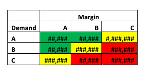
A more interesting analysis is to put two of these ABC analyses together in a matrix format and see where the inventory lies. For example, one could look at demand ABC against the margin ABC. This might look like the picture below. Please note that the number of # symbols signifies the amount of inventory; thus, in the example below, the inventory in cell representing A demand and C margin is the highest. The red-yellow-green color schema signifies the desired nature of that inventory. All things being equal, one would like to have more in the high demand (A)-high margin (A) category.

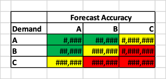
One could further take this analysis and look at things based on forecast accuracy. The theory says that if the forecast accuracy is better, one should be able to manage with lower inventory. But is this the case in your data? The best way to find out is to chart something like the table below.

If the inventory is high in low forecast accuracy items, the chances of obsolescence are higher. However, given the lot sizing and other supply parameters, it also might be an inevitable result. One should carefully analyze before reaching conclusions on any actions.
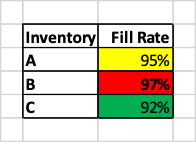
Finally, let us think about fill rate or on time in full (OTIF) metric. Both these are measures of customer service. If the inventory is high, the business should be able to meet the demand and get a high fill rate score. Is that what the data is showing? For example, in the table below, why do we get only 95% inventory levels for high inventory (A) items and 97% for B?

Summary: Analyses like the ones above can get a team pointed in the right direction about the places to look for mismatches that create bad inventories. Of course, a more advanced analysis would begin to look at metrics that combine two data, such as days on hand (DOH) which combines inventory with demand. But that is for another day.
Enjoyed this post? Subscribe or follow Arkieva on Linkedin, Twitter, and Facebook for blog updates.


