calculation")
Key Points on MAPE:
- Mean Absolute Percent Error (MAPE) is a useful measure of forecast accuracy and should be used appropriately.
- Because of its limitations, one should use it in conjunction with other metrics.
- While a point value of the metric is good, the focus should be on the trend line to ensure that the metric is improving over time.
Businesses often use forecast to project what they are going to sell. This allows them to prepare themselves for the future sales in terms of raw material, labor, and other requirements they might have. When done right, this allows a business to keep the customer happy while keeping the costs in check.
One of the key questions in the forecasting process has to do with the measuring of the forecast accuracy. There is a very long list of metrics that different businesses use to measure this forecast accuracy. Let’s explore the nuances of one of them.
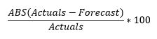
Mean Absolute Percent Error (MAPE) is a very commonly used metric for forecast accuracy. The MAPE formula consists of two parts: M and APE. The formula for APE is:
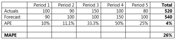
The M stands for mean (or average) and is simply the average of the calculated APE numbers across different periods. It is derived by dividing the APE by the number of periods considered. Let’s look at an example below:
Since MAPE is a measure of error, high numbers are bad and low numbers are good. For reporting purposes, some companies will translate this to accuracy numbers by subtracting the MAPE from 100. You can think of that as the mean absolute percent accuracy (MAPA; however this is not an industry recognized acronym).
100 – MAPE = MAPA
MAPE in its ‘textbook’ version is the most popular accuracy measure for these reasons:
- It’s fairly easy to explain. Its popularity probably feeds back into this.
- It does not depend on scale and can apply easily to both high and low volume products.
However, there are reasons why this error measure has its detractors:
- If MAPE is calculated at a high level (think product family, or business level or across different periods) the pluses and minuses cancel each other out to (often) paint a very rosy picture.
- For this reason, consider Weighted MAPE (WMAPE) when reporting the forecast error to management as they only look at the forecast error at a very high level.
- This example is obvious in the first table. When calculated at the aggregated level, we get an APE of 4% whereas taking the average calculates a MAPE of 26%.
- MAPE does not provide a good way to differentiate the important from not so important. For example, what if the error is 90% on two products; one averages 1 million units per month and the other 10 units per month. Both get the same error score of 10%, but obviously one is way more important than the other.
- For this reason, consider using Mean Absolute Deviation (MAD) alongside MAPE, or consider weighted MAPE (more on these in a separate post in the future).
- MAPE is asymmetric and reports higher errors if the forecast is more than the actual and lower errors when the forecast is less than the actual.
- As the author (Armstrong, 1985, p. 348) says: “This can be explained by looking at the extremes: a forecast of 0 can never be off by more than 100%, but there is no limit to the errors on the high side.”
- In business terms, a high forecast has the potential to give unlimited percentage error when the observations (actuals) drop unexpectedly. This is more common because of plant shutdowns etc. than sudden huge increases.
- A discerning forecaster might well minimize their MAPE by purposely forecasting low. This will probably encourage pre-existing ‘sandbagging’ behavior which is reinforced in organizations via wrong bonus/reward structure to encourage “beating the forecast.”
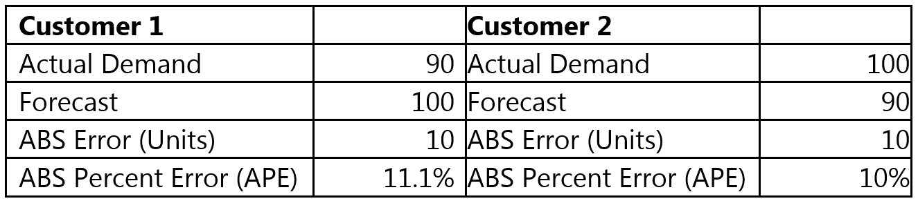
- To look at this from yet another angle, see example below: Customer 1 buys an average of 90 units per month; customer 2 buys an average of 100 units per month. See table below. The same absolute error (10) produces an error of 11.1% in one case and 10% in another. However, for the same product, a miss of 10 units is equally important in both cases.
- Some companies have a tendency to over forecast which can very often be attributed to overconfidence bias. If this is the case, dividing by actuals (a smaller number in this example) results in higher error rather than dividing by forecast. This is one reason why these organizations have adapted a different version of MAPE where the denominator is the forecast.
- This, however, is also biased and encourages putting in higher numbers as forecast.
- What is the percent error when the actuals are 0 or a small number (< 1)? The error percentage calculated is very high and skews the results. (This problem does not go away when you change the denominator to the forecast, it just shows up elsewhere). Most practitioners deal with it by using a cap (say 9999%) on the error, or ignoring the ‘outliers.’
I hope this is useful info on the MAPE as a forecast accuracy metric. Since MAPE is so popular, it has many variations which I have captured in this post titled the family tree of MAPE. I am interested in your thoughts and comments.
Like this blog? Follow us on LinkedIn or Twitter, and we will send you notifications on all future blogs.