
Little known secrets to avoid these common data visualization pitfalls.
Research shows that our early human ancestors used proto-writing to communicate. Proto-writing is a set of symbols or images used to communicate during the stone ages. No matter how evolved we are today, we still respond better to simple, easy-to-understand visualizations of concepts.
Thinking about this in terms of the Supply Chain world, whenever we present data to help improve our existing S&OP process, it’s essential to create a pictorial view of the data that’s easy to understand. Sometimes, it’s not what, but how you present it that makes a difference in communicating and creating a cross-collaborative process.
Make Your Data Presentations Easy to Validate and Believe
As people that have an inherent bias to trust our feelings and distrust data, it’s critical to make your data presentations easy to validate and believe.
In Arkieva COO Sujit Singh’s Forecast Reporting blog “How to Report Forecast Accuracy at Sales and Operations Meetings”, he outlines the three key elements for presenting your data as:
- Keep it simple
- Show the trends
- Drill down to the details
In this post, we’ll focus on some common pitfalls to avoid when trying to visualize your data. While most of these pitfalls are easy to avoid, they can be sometimes overlooked.
7 Common Pitfalls to Avoid When Visualizing Supply Chain Data
Keeping Your Data Visualization Simple
1. Use commas when presenting data in a number format
Pop Quiz: Which number of units is bigger from the table below? A or B?
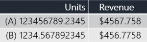
Figure 1
Answer: A
Now, let’s try this again using the Figure 2 below. Which number is bigger?
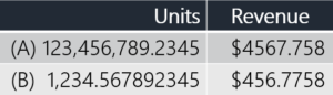
Figure 2
The answer again is A. You may have noticed that it took you less time to decide which number is bigger just by the fact that I added commas.
2. Please use currency or relevant symbols to differentiate between types of numbers
Let’s look at another example, which of the data columns in Figure 3 below represent money?
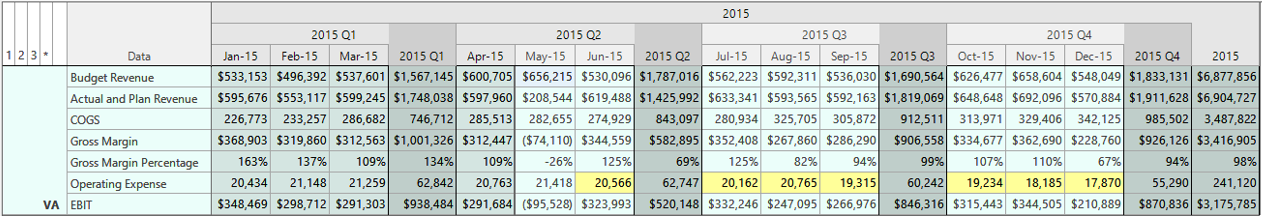
Figure 3
Did you get this right?
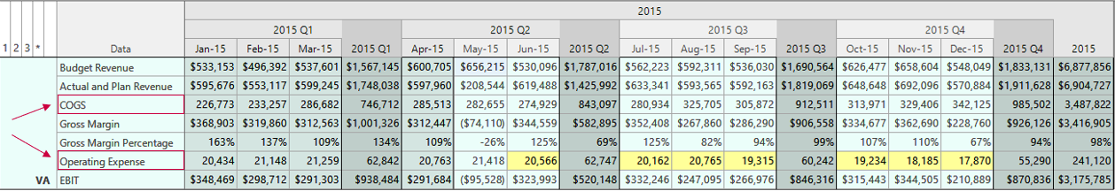
Figure 4
Did you catch Cost of Goods Sold (COGs) and Operating Expense from Figure 4 above? You may have noticed that visually, it was easy for you to quickly catch all the data columns that had a $ sign associated with it.
Pro Tip: Remember, adding clarification prevents you from losing your audience. The last thing you want is to spend a lot of time preparing your presentation for your S&OP meetings only to see a lot of confused looks.
3. Limit Numbers After Your Decimals or Round off When Necessary
How many digits after a decimal point is considered too many?
Showing Units
Let’s look at our first example from figure 1. While the number 1,234.567892345 may look more accurate, since a business can’t produce half of something, it’s important to round this number off to the nearest whole number.
Making: 1,235 units is easy to understand.
Showing Currency
In currency cases like the revenue number shown below, most people only need to see just two decimal places.
That would make it: $456.78. Again, rounding this off and limiting the decimal points to two decimal places would be the simple way to represent the data.

4. Don’t Go ‘Zero’ Crazy
In the business world, it’s always nice to see a nice cheque from a customer with a lot of zeros. However, it doesn’t mean your presented data should always have lots of zeros. Let’s look at an example:
(A) 2,345,000,000
OR
(B) 2,345M
Which of these two numbers could you easily process? I bet it was B! When reading B, you didn’t find yourself counting zeros (which can get tricky, depending on the time of the day and if you’ve had a cup of coffee or not).
5. Be Mindful of Your Colors
Can you read the text from Figure 5 below?
Bright colors always need darker font colors. Dark colors need lighter font colors. When in doubt, keep it simple and remove the colors. Only highlight essential numbers or data points to help you better tell your story.
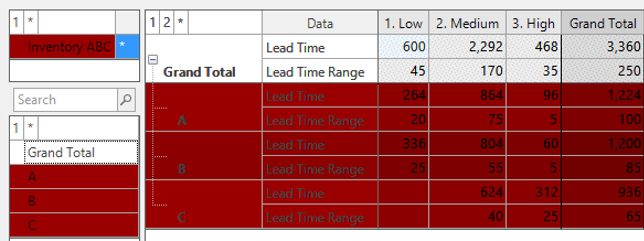
Figure 5
Showing Data Trends
6. Don’t do a Data ‘Puke’
We are enthusiastic about data. And, if you are anything like us, when you create an integrated one-plan process with an advanced planning system like Arkieva, there is a likelihood that you’ll want to show a lot of data.
To ensure that you don’t lose your audience who may not be as excited (unfortunately), it’s critical to only select the data that’s needed as evidence to back your story. For instance, if you want to tell a story about how you might stockout due to rising demand, only show the rising demand trends, perhaps segmented according to different customer groups – products/locations, etc. Unless there is a clarification needed, you don’t need to show your backend forecasting methods that you selected or how you calculated your forecast accuracy. Showing data like this upfront could immediately transform a discussion on how to meet excess demand to if your forecast is even accurate in the first place.
7. Don’t Forget to Tell a Story with Your Data
Not doing a data puke really goes hand-in-hand with focusing on your story. To explain this concept, let’s take a look from a general storytelling perspective. Usually, when you tell a story, you have three basic parts to the story – introduction, the main message, and the conclusion.
The basic concepts to remember can be summed up this way:
Introduction – This is your chance to grab my attention. Be clear and concise, but also help the listener connect with you.
To do this start with the why.
- Why should the user care about what you have to say?
- Why do they need to do extra work based on your recommendations?
- Why are we even having this meeting?
If you lose the connection from the start, it might be difficult to get back on track later.
Main Message – Now, that you got my attention, make your point with data. This is where using some of the good visualization tips and techniques that we’ve discussed above comes into play.
Pro Tip: Always have a roadmap of what your story’s main message is mapped out.
This is true for most writing storytelling concepts and is true for presenting your data in an S&OP meeting. For instance, to create this blog, I came up with a working title and an outline of how I wanted to structure the blog. I filled in the sections, then, I went back to see the areas that I had missed the mark on my original goal. Then finally, I aligned my working title with the final blog message.
Conclusion – Summarize all that you’ve discussed. Leave me with things to think about or do.
Presenting your data is just like any storytelling exercise.
- What’s the conclusion from looking at your data?
- What should we end up doing?
If you don’t think through and present your conclusion, you can spend a lot of time creating beautiful charts and graphs, and everyone could leave the meeting with a different conclusion.
See the conclusion as a means to drive home your point that you made in the main message.
Pro Tip: An easy way to remember this storytelling technique is the following:
Always tell me the why (introduction), if not, I don’t care about the how (main message), and I certainly won’t want to do what you want me to do (conclusion).
Drilling Down to the Details for Emphasis
In the end, while it’s vital to map out your story so it’s easy to follow, your details will end up driving the point home. Select the type of drill-down needed based on your audience’s level of involvement. For instance, senior management might be more interested in high-level details while the planning team might want a deeper data deep dive. The level of detail that you show should be tailored to you and your audience goals.
Data is impactful. The power of your data lies in how you bring your data to life.
Happy Analyzing!